Wednesday, August 31, 2011

Pro Combat 2011


I haven't been doing as many concepts as I'd like to. But I have started a mini project with some guys, trying to redo the Pro Combats, because so far, they aren't impressive.

Army- White
Boise State- White
Georgia- Dark

LSU- White
Michigan State- Dark
Navy- Dark
Ohio State- Dark
Oregon- Dark
Stanford- Dark

The bolded teams are done.

Saturday, August 20, 2011

Los Angels Angels

Alright gang, I've had this done, but forgot I never posted. LA's original team used a Dodger-esque LA logo, which you can see. I mixed styles a bit, with the font they used in the time period. The colors are a bold look like the team now. The primary is similar to my angel's concept, and there are obvious halos on the A's. I decided to go with the vests. My thinking was that if the current team had vests in their history, then this team's history would've too. Plus, no team has them yet.


Hollywood Stars

Another team that got cut out when the Dodgers moved west. The logos are drawn back to logos they had. The primary is roughly based off this

and the H-star logo on the caps. The scripts are cursive, similar to the ones that eriq posted. I did change the colors from navy, just to differ them from the Angels. On the jerseys, I didn't go with the ones eriq posted. I'm not a fan of that look at all, to be honest. I did a throwback piping that runs down the sleeve. I did have sleeves, but went against them when I posted.


Tuesday, August 2, 2011

Sacramento Solons

Sacramento Solons
Alrighty. The team name is based on an actual person Solon was a Greek law maker way back around 600 BC. Sac-town being the capitol, they have Senators, obviously. The term Solons is a synonym for Senators. This logo was based on the California capitol building.

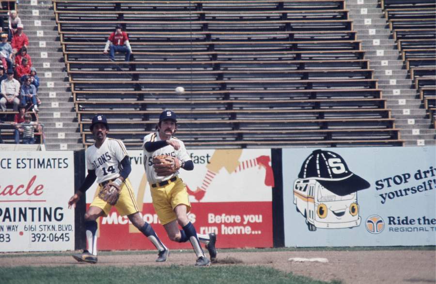
So, keeping that motif, I traced a picture of it. I tried to make it sleek, like the National's capitol building. I traced, made it two colors(The gold part is a darker color, and I made it yellow for the scheme. Since it's a Greek term, I thought a Greek Wreath would be a good add on. I kept the S cap logo from the time period, because it's pretty classic, I guess. The font is just a simple font, because I felt that matching it to the cap wouldn't work with the primary. The colors are used from the 1970s team, which trotted out in these.

The jerseys are loosely based on the link. I didn't want to use racing stripes, so I did a jersey like the Phillies' road set. It was a pretty simple design, I thought. On the caps, I gave them a yellow bill, when yellow became more prominent in my set. I thought of doing a Seattle Pilots wing look, but that wouldn't have existed!


Monday, August 1, 2011

San Francisco Seals

So far, this is my favorite. The team is one of the teams that got screwed over when the Giants moved west. The team is traditionally navy and white. But I have seen logos with orange. I thought that would be neat, so I changed the old orange to a darker rustier orange, like the Golden Gate Bridge. The primary logo is a circle logo, simple, but I traced a seal logo, and made it modern. If anyone wants to see it up close, I have no problem with looking at that logo again. The SF logo is a modern version of the one they used. The two letters are drawn. Same witht he script. I've never done a script like that. Well, I did do my Dunedin Scots, but I did this one better. I went with orange with navy outline, because lighter with a darker outline looks better. I brought back the pin stripes, and went pretty simple on them.

Seattle Rainiers

One of the oldest teams in the league. Seattle had the Rainiers from 1919-1976. They almost played every year(not 1968-1972), partially due to the Seattle Pilots. The team was named after the nearby Mount Rainier. I wanted to include that in the logo. I changed the colors to a more pacific north west scheme, from the original navy and red. The color is a dark green, with the lime green and blue from the Sounders. I made an arched script, sort of a reference to the mountain. The Primary is the script with the mountain over it. The jerseys are simple, piping on sleeve jerseys. The number font matches the script. Instead of a grey jersey, I decided to take the green, and make it have a grey tint. So that is what that's all about.

Vancouver Mounties

This team moved from Oakland(Oaks) to Vancouver for the 1957 season. The logo I had in mind first was the MV cap logo you see. That was what I was excited about the most. That logo is what I based the set off of. A simple look with a block font. The primary logo I'm indifferent about, and I'm open to suggestions. I used a simple block script, and made the middle letters smaller just to change it up. I used red a lot for the jerseys. The caps were ALMOST khaki. Just kidding, but that would've been cool. They're red, and as you can see red with black accents run throughout. There is also a maple leaf on the sleeve.

Pacific Coast League

Alright. So here we go. I wanted to do something that is new, something different.

I was looking at this stadium website, and I came across a page with temporary stadiums. They included stadiums for the Dodgers and Giants, before Dodgers Stadium, and Candlestick park were built. The teams there were the Los Angeles Angels, and San Francisco Seals of the Pacific Coast League. I researched the liked what I saw. Some cool identities could be made, so here is what I made. The PCL was a very strong AAA ball league. The 8 team league was a league of their own, pretty much. The farthest west the MLB was in 1957 was in St. Louis. So with the closest team being over 1,500 miles away, they did their own thing. The Sacramento Solons actually did not have an affiliate for 1957. When the Giants and Dodgers moved, that scattered some teams, to Places like Phoenix and Honolulu. Teams like the Padres and Angels got their name from the PCL teams.

But what if the league decided to break ties with the MLB, and be their own pro league. Sure, there are some aspects of this I really didn't think out COMPLETELY. But here is a basic rundown. I'm making sets for teams from 1957. The logo has a palm tree and a mountain, for the south, and north pacific coast. Also note my cool 1950s template based on Chevys of that time.