Saturday, July 30, 2011

My Infographs

An infograph is a graphic, with information on it. Normally a chart or a graph. I've made a bunch recently, and I want to share! These are all self explanatory.


Winnipeg Jets Concept

I'm not a fan of the currents. I like what they went for, and it was just poorly executed. Nothing says hockey. It just looks like clip art. I wanted to change that. I wanted to make it more hockey friendly. I made the primary idea, the alt. With a few changes, obviously. I looked at Davidson's looking on how he worked his jets. I decided to use the Thrasher's shape, and put a jet in it. I decided to make the plane have a lighting effect on one side. I went with a stencil font just because I like what O'Brien is doing with his concepts with this font. But I'm gauging responses, and could change it.

The Jerseys are a simple design, and the alt is a throwback to the Ottawa RCAF Flyers that won the gold medal at the 1948 Olympics.

Monday, July 18, 2011

CFL Pro Combat Pt 1

You heard me.

I've done a NFL series before, and I thought it would be fun to do some CFL concepts. In alphabetical order...

1/8 BC Lions
I didn't want black to be a major part of the jerseys, like the all black alt. These two follow the home and road sets. I made a sleeve design complete with piping. I put the alternate claw logo on the sleeves, so there wouldn't be 3 BC logos visible from the side. Also, the logo when backwards would habe the letters backwards. The numbers are located on the sleeves. Lastly, the pants were meant to match the jersey.


2/8 Calgary Stampeders
This was the last one I did. I like piping, there I said it. But not just piping can be found, I put a shoulder stripe running front to back, studded with black circles making them seem like horseshoes, inspired by the unused alternate logo. I thought the numbers worked well with the set, and it just happened to be the Broncos' set. I decided to make another set with the nike triangle gradient on the sleeves. The gradients are also on the pants stripe.


3/8 Edmonton Eskimos
I changed the logo. NO BLACK. I didn't realize how bad the logo looked like that. I deleted all forms of black. One thing that works, is the Packers' yellow/green/yellow/green. I didn't like how they had green monochrome, so I matched it with the packers. The sleeve stripes remain the same, and I threw in piping to separate from the Packers. I also didn't put yellow outlines on the numbers.


4/8 Hamilton Tiger Cats
I decided that a yellow jersey would be very nice. I gave the set tiger stripes, giving it it's own feel. Tiger stripes should be prominent in this set. The yellow socks make the leotard look a non factor. On a unrelated note, I think the Tiger-Cats have the best logos in sports.

CFL Pro Combat Pt 2

5/8 Montreal Alouettes
A throwback. The current sets are a mess. Absolutely terrible. I did give them a similar look, with different sleeve colors and underarm/shoulder stripes. One thing you might notice, I changed up the logo set. I changed the colors to Canadiens' colors, cleaned the logo, and returned the AM logo. The helmets return to white, from silver. I chose not to have outlines to match the old sets.


6/8 Saskatchewan Rough Riders
I went modern with this set. The mesh cuts are black, with white trim balancing out the green. The under sleeves use the wheat pattern fond on the logo. I used the Miami looking two tone numbers on this set, because one team had to do it. The pants stripe matches the jersey pattern.


7/8 Toronto Argonauts
The jersey is fairly similar to the currents. The only difference is the Nike gradient used once again. I returned the Argonaut logo, which would be a good return with the right colors. I really like the two colors together.


8/8 Winnipeg Blue Bombers
This is another return to retro set. I made the logo more retro, excluding outlines, with a new set of my own. This follows the Oregon State sleeve stripes, which would look very nice. The chest did seem rather naked, so I threw some piping on.... I have a problem.

Sunday, July 17, 2011

My MLB Caps

So these are MLB caps according to me. There was a thread on CCSLC about what you would make the MLB's caps look like. Some of them are logos from when I redesigned the MLB.
Seen, here.

Friday, July 15, 2011

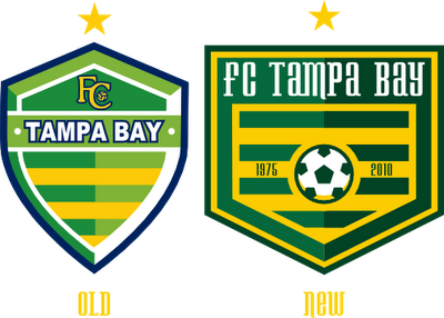
FC Tampa Bay MLS rebrand

Just want to say, there are no actual rumors about the team joining the MLS, this is all for funsies.

In the "Top 3 soccer crests" thread, I saw how amazing the Ft. Lauderdale Strikers logo was. I was jealous, because they're my home team's rivals, and our logo kinda stinks.

So last night I started sketching a logo. I realized that I do soccer logos better freeform on inkscape. I really didn't have any aspects to keep other than green and yellow stripes, a star for the NASL championship, and the team name. I decided on a home plate shape crest, just something simple. The old and new team both had green/yellow/navy color schemes. I decided that I could change that. I swapped navy for a darker green. I've never made a soccer ball using shapes, I would always find clipart or something, but I'm glad I did for this. I made a cool soccer ball similar to most teams these days. The years on each side are the years the Rowdies were first founded.


The jerseys are a mix of the currents, and old set, but mostly the old set. You know what? Just look.

I did a stadium concept, which can be seen on Stadia Arcadia.

Saturday, July 9, 2011

MTC: Bloomington K9

I've always wanted to do this concept. K9 would be a very cool name for a minor league baseball team. It's unique, and has 9, similar to baseball teams of old. I sketched up the dog, made it on inkscape, adjusted, and here it is.

Friday, July 8, 2011

MTC Design


My friend Neil from Minnesota and I were talking about starting a design company deal. Try to promote ourselves, and make some cash. His nickname is TC, and we were coming up with things that it could stand for(Such as Top Cat). We started thinking, and he said if we ever go into business, our name should be MTC, and it could mean anything. I said, “Why don’t we?” We decided we would make logos for the new company, and get back to eachother. He went to bed, and I went to work. The next morning, I messaged him this logo on facebook, and he responded, “Fuck you.”

I also made a template.


If you see this, and have a request, feel free to ask!

Yakball Jerseys

I made jerseys for the 6 teams planning to play yakball with me. What is yakball? Look at the post under. I will be on Palm Harbor.