Hi everyone, today I'm posting my first soccer art work, since it is 3rd in the poll for the first logo tournament. So i made new logos for the
MLS teams without shield type logos. First off, is a Kansas City Wizards logo, that I did twice because i
accidentally saved over it with my Columbus Crew logo coming up

I made a shield and
Incorporated their old
rainbow soccer ball logo in it, and most teams that won a championship put stars in their logo, and KC has won 1
championship. Next, this logo has stars, because their patriotic, not because they won anything(they lost in the finals last 3 years), New England Revolution.

The logo they use in real life is just
an American flag, drawn with crayons. Last when you see the
Columbus Crew logo, what do you think...I think of
Devo in their hats. Anyone? So i just made a new logo, with the Columbus Skyline.

Its better than the
Devo logo. So
that's all i have for today, I think
Kevin's gonna get the rests of the posts this week, cause hes going out of state for a boyscout thingy. So next week, its all me. Any comments, questions,
sarcastic remarks? Comment bellow, or email us.
Mykl out

 The old logo, had a M and the sun effect going, so I worked them in. Next I have the kits. I used the Danish Euro 08 kit. With numbers, and socks from the Saudi World Cup kit.
 Cool. I LOVE making soccer rebrands, Ill have a lot more coming soon, stay tuned.

 I used the Eagles (darker) green, and the
  I used the
  I like it as an alternate., always thought they should do something like this. Next is a Jets logo that actually has a jet in it.
 Well
Well 
 Then I have a Vancouver Canucks jersey with out the city name on it.
 I like this a lot. Kinda selfish but I think I really did good. If you have comments, comment bellow, or my email is found on the right side of the page.
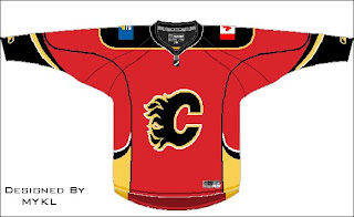
 I think its an improvement. Compared to those tacky stripes that swoop across the front of the jersey.Then I have a Calgary Flames Jersey that is toned
  Lastly I have a Chicago


