Showing posts with label Football. Show all posts

Monday, December 26, 2016

SportChek Dominion Bowl

Concordia Stingers (4-4)
vs
#8 Carleton University Ravens (6-2)


Ottawa would be a great bowl location, just based on it's location. I have them lined up to host the 4th best Ontario team and the 3rd best Quebec team. As it so happens, Carleton is from Ottawa, which would be a big draw. Canada has a long history with the word Dominion, so it felt fitting to name the bowl in Ottawa that. I just wasn't in love with the "Capital" bowl theme originally when we were brainstorming. The game is sponsored by the Canadian sports wear store SportChek

--

I wanted to emulate the red check on the SportChek logo, so I wrapped it around the white base. I did my best to match the font on the SportChek, then put a maple leaf inside the O.

Tuesday, December 20, 2016

Stampede Bowl presented by Shaw

Ottawa Gee Gees (6-2)
vs
#9 University of Saskatchewan Huskies (5-3)


This game would be played in a big town with a major college presence. The Stampede Bowl is the second farthest west game, and would feature the 3rd best Canada West team and the 5th best Ontario team. Though this would be a long trip for Ontario, they have such a good amount of teams that 6/8 games is bound to have that happen. 

--

Obvious cowboy theme here. Originally had a sharper logo with no sponsor but ended up hating it. I used the cowboy hat from the city flag, a red and black color scheme, an old western font, and some barbed wire I had designed previously. Went for a cleaner look overall.

Friday, December 16, 2016

Trillium Bowl presented by Air Canada

Guelph Gryphons (3-5)
vs
University of British Colombia Thunderbirds (3-5)


Originally scheduled to be played at BMO Field, we decided to relegate this game to a lower game and move it to the historic Varsity Stadium in Toronto. The stadium has hosted Grey Cups and Vanier Cups, but is now down to 5000 seats. Guelph finished 6th in the OUA, and BC finished 4th in Canada West. The game would feature the teams ranked the lowest in a game,  just due to the amount of 3-5 teams. We ranked them 14th and 15th, the top two 3-5 teams in the league.

--

In the conference tournaments I mentioned earlier, all of them have 4 team playoffs, except Ontario who has 6. I felt the 6 Ontario teams in our system would be able to hold their own against a team that finished around the same in their conference.

Canadian Bowl Movement by the NeatO Gang

Who doesn't love a good Bowl Movement? Whether it's the Bitcoin St. Petersburg Bowl, the Raycom Media Camellia Bowl, or a Toilet Bowl, bowl games are just so much fun.

But there is a place with college football that don't have bowl games. That place is Canada.

A basic rundown of Canada's football landscape is this. 4 regional conferences, and no out of conference games. The conferences have a playoff to determine the champion, then the winners go to their respective semi final game. The easternmost is the Uteck Bowl, while the westernmost is the Mitchell Bowl. The winners of THOSE go to the Vanier Cup to play for the National Championship

Up until this year, their version of the NCAA was the Canadian Interuniversity Sport. They rebranded to U Sport. The new brand is bold, and is a fresh look.

That's where the NeatO Gang comes in.


So Matt, Dynamo, and I created the Bowl Alliance. It's 8 bowl games, then the Vanier Cup. The 8 games are all over Canada, and the final would be the day before the Grey Cup in the same stadium. My thinking is that neutral fans would be more inclined to go to the game if it's a whole weekend event. The games would be played on (mostly) turf fields, so wear would not be an issue.

The 8 games will mostly be towards the east, due to the west being such a big conference. So that's why Regina and Edmonton aren't hosting. That, and there is only 27 schools that have football programs. The saving grace is that there is talk of expansion, and inter conference play.

Ok so moving on. This is heavily like the NCAA's playoff system. We have 4 games that I coined the Bowl Alliance. Then, similar to the "Group of 6" games, we have the Elite Bowls. Two in the east and two in the west, they will host the game no matter. But between the two, will rotate the rights to give away the Uteck and Mitchell trophy. Each conference would host their championship game between the two best teams. After that, the bigger 3 conferences would get an automatic bid to the playoff. With the conference in Atlantic Canada being left out. This is due to them having 4 teams, and for their best team to be ranked #10 with a 7-1 record. The team to play Canada West's champion would be the best at-large team, or the champion of the AUS.


So see those logos? Those are new thanks to yours truly. Here are the current.


They're average to bad, so I remade 3 of them!


I believe that's it. So sit back and we will release each game one at a time! Games and records reflect the 2016 season as it has already happened.

Tuesday, February 9, 2016

Creamer Boards Super Bowl Shuffle


The year is 2020. Super Bowl LIV just had been played, with the Buccaneers beating the Jaguars in the second straight year. The game went on as normal, with tons of media build up, expensive commercials of companies using hip memes of the day, and the traditional game of gridiron football. However, there was a dark tone to the game. This would be Roger Goodell’s last Super Bowl as commissioner. Goodell had become a tyrant, renaming the Lombardi Trophy after himself before Super Bowl LIII, and doing anything to make money(which he was found out later to be pocketing).

Lead by the NFL Players Association, and former players started a coup to seize power from Goodell. Goodell claimed it was a “War on Football”, which is the first and only time this term was correctly used. It was a rocky few months, but it happened in the off season. The NFLPA gained control, and started democratic elections of the commissioner. Goodell was exiled to a place that would never see a professional football game again, London. 

In an attempt to wipe out the “Goodell Years”, the new NFL commissioner Marshawn Lynch had a bold idea. With the help of NFL Films, they would get rid of all traces of the chrome Super Bowl logos that had been made to be standardized and look futuristic. NFL Films agreed to doctor the film of the games to include new logos. This meant new logos of the last 10 Super Bowl would have to be made. They are looking for bold, colorful logos that reflect the year the game was in and the host city.

We at Chris Creamer’s Sports Logo Community have been given the task to design the 10 logos. Each round will consist of a branding periods of 2 weeks. After those two weeks are up, I’ll post the logos without the maker’s name. We’ll have a typical voting process of naming the top 3 logos, all earning an associated amount of points. When we total up the amount, the top 10 vote getters will be posted and points awarded based on the current F1 point system. This final point system will add up across all rounds. The final round will be Super Bowl LIV, worth double points due to the game returning to Los Angeles, and still being in the public’s consciousness. Most points after all five round wins. Contestants can only submit concepts for one game per round, just to keep an even field points wise.

Here are the rounds

Round 1
Super Bowl XLV - North Texas
Super Bowl XLVI - Indianapolis

Round 2 
Super Bowl XLVII - New Orleans
Super Bowl XLVIII - New York/New Jersey

Round 3
Super Bowl XLIX - Arizona
Super Bowl 50 - San Francisco Bay Area

Round 4
Super Bowl LI - Houston
Super Bowl LII - Minneapolis
Super Bowl LIII - Atlanta

Round 5
Super Bowl LIV - Los Angeles

So sit tight, we're gonna start Sunday.

Saturday, January 2, 2016

Outback Bowl Alternate History

So it's bowl season! The best time of year for any football fans. There are too many bowl games, let me say that now. There's also a lot of corporate sponsorships that drown out the legacy of the game. Some are fine, such as the Valero Alamo Bowl. Then there are games, like the Belk Bowl, that have no history or indicator where the event takes place. The Belk Bowl could hypothetically take place in any city with a large enough football stadium, because it hardly gives you any indication that it's in Charlotte.

My home town bowl is the Outback Bowl. Outback Steakhouse is from Tampa, but generally people don't know that. The Outback Bowl just celebrated their 30th anniversary in Tampa. The game originally was the Hall of Fame Bowl, which was played at the Iron Bowl, and is a lame name.

So I rewrote bowl history.

So the Tampa Bay Buccaneers were real bad in their first few seasons. Though the team was new and exciting, they needed to build a fanbase. Former USC coach, and then Bucs coach John McKay pitched a bowl game to take place on New Years Day, when the Bucs stadium would (most likely) be empty. The game was accepted by the NCAA to be played January 1st, 1979. 

The Bucs owners became a part time bowl committee. To tie the game to the pro team, they decided on the "Treasure Bowl". The initials would be TB, and they could continue to sell the pirate theme. In addition to this, they had the city move the traditional Gasparilla Parade to New Years Day, in a smaller homage to the Rose Bowl Parade. They decided the best plan of action was to have a team from the Southeast, and a Big Ten team to draw the local fans who are near Florida, or may have moved there.

Michigan State and Florida State both finished 8-3 in the 1978 season, and were hand picked by the committee. The first game was won by Michigan State 23-17


The game became a success. With Florida, Florida State, and Miami becoming very good in the following decade, the bowl committee started the tradition of a Big Ten vs SEC game. In 1995, the hometown company Outback attached their name to the game.

Penn State would win 43-14 over Auburn.


The game soon moved to Raymond James, and the pirate ship really fit in the theme they were pushing. The community rallied around the game, and gave the city a true identity.

This year Tennessee and Northwestern faced off, with Tennessee rolling 45-6.


I love doing time-based concepts, and I tried my best to make the presentation seem like it really was made those years. I made the original logo, then figured the script was strong enough that I could change and still seem pretty modern.


Sunday, September 27, 2015

Footy as Football - Liverpool

So the last team I have is Liverpool. I wasn't sure how I wanted to do the Liverbird. I thought about doing a Seahawks style logo, but ended up cutting it's head off. 

The team is name the Reds, but I chose a white helmet. On white, the red logo would look just like it does on the crest. I put the Hillsborough flames on the back of the helmet just for symbolic reasons too. The rest of the uniforms are red, like you'd see a Liverpool kit. My idea was a "red and white USC", so I used that template with white instead of red.


This is my last one, so thank you to everyone who followed!

Footy as Football - West Bromwich Albion

This one was one of the hardest I had. There's only so many ways to make a bird logo. I wanted to do a spread wing logo, and figured it'd be funny for a small song bird to look super mean. 

The color scheme with brown and tan would be unique, and would let me differentiate it from other teams. I really wanted put a lot of details into this one, so I threw numbers on the back of the helmet, a bird logo patch, and some Texas A&M stripes. The gold pants are the only one of it's kind in this series, and it only took till 19 to do it!


Footy as Football - Manchester United

For United, my goal was to make a mean looking devil. The devil on the crest is a nondescript blob, so I had to go from scratch. I played around, tweeted my result, then realized everything I did wrong while I was at class, and made this. My favorite part is the MU as the wrinkles on the forehead.

The uniforms are pretty bland, but I wanted them that way. I put a pitchfork on the helmet, horns on the jersey, and made everything on red black. Like the real team, the pants are white with black accents.


Friday, September 25, 2015

Footy as Football - Everton

I really wanted to put the tower on this, but it just wasnt working. 

I figured that I could make a boring E logo and carry on like they were the Colts. The helmets have wreaths as pride stickers on the back, something I haven't used yet. The uniforms are a mix of classic and modern. Plain white pants, and abnormal white stripes on the sleeves with the Broncos number font


Tuesday, September 22, 2015

Footy as Football - Stoke

Stoke is all about tradition and the fact they were formed in 1863, so I went super old school. I made a wishbone S, inspired by the bears. It was symmetric and felt like I could get away with it.

The uniforms are classic though. I thought a winged helmet would represent the traditional Stoke stripes in a way I hadn't yet. The uniforms are SUPER boring, but I felt like it was necessary on such a storied look. This one may not stand out like the others, but I thought that if any team could rock it, it would be Stoke.


Footy as Football - Crystal Palace

This one was inspired to be different from all the other birds I had done. I wanted to do something bold, but keep it simple, just so the logo stands out. I did this one immediately after I did Manchester City, so I couldn't take some cues. I went with a logo inspired by the Atlanta Hawks, But added more detail and made it an actual eagle. What's funny is the current Palace crest is super detailed and modern

Palace honestly have some of my favorite kits, so the color balance had to be there. I couldn't do a half kit, but I did my best to put as much blue and red as I could. The helmets and pants are red with the jerseys blue. Each is accented by yellow just to make sure you don't forget about it.


Footy as Football - Aston Villa

This has been approved by 2 different Villa fans!

So I was going to go with the lion head, but I needed to make it just the head, and add more definition. I completely redrew the head, and added some facial features. Keeping true to the crest, I put a star off to the northwest of the lion. I put a light blue outline on it so I could use the yellow JUST on the blue like the crest.

The uniform is different from the others, I went with a Patriots style uniform to reflect their kits and use checkers on the pants.


Sunday, September 20, 2015

Footy as Football - Sunderland

Hot off the presses, here is Sunderland!

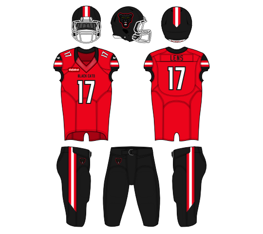
The worst team in the league are nicknamed the Black Cats. Their logo has two panthers on it, so it was a good indication of what kind of logo I should make. The biggest issue was all the dark shades of black, which really was hard to see at times.

The kits are a hodge podge of classic football designs, with some sleeve stripes and a simple helmet stripe, I did my best to both stay true to Sunderland, and different from the other red and white teams I made.

Update: Gave them black pants to separate from Southampton


Wednesday, September 16, 2015

Footy as Football - Manchester City

City is probably(by far) the best team in England right now.

So to separate from the other "Eagles" team, I went with the Citizens. But I still felt an eagle would be the best logo option. The one from the crest is gold with a black outlines, so I did my best to add some lighting and shading. My favorite part of the series has been doing all these animal logos I never have been able to with soccer logos.

With these City kits, I went with a little more balance than the current ones. The light blue is the main color, but I used a lot(a lot) of black and white. Something more gridiron football like, and less what City actually look like.

Update: Added a lot more black to darken the look


Monday, September 14, 2015

Footy as Football - Chelsea

The best team last year, may be the worst team this year, but I still support them!

So a lions head was obvious, and I just had to make it Chelsea like. So I went with a blue lion and a white outline to tie it to the lion on the crest now. I used some light blue which is also on the lion in the logo. Same with the red tongue. 

The kits are head to toe blue, much like the current look. I wanted some accent color, so I did some red stripes on the white cuffs and collar. The red continues to the stripes on the helmet and pants.


Tuesday, September 8, 2015

Footy as Football - Tottenham

I had this sketched out very early on in this series.

For spurs, I wanted to keep the rooster theme, but make a more dynamic looking logo. I went with a sharp foot with a spur on the leg. I thought the foot would look really nice on a white helmet, so I designed it with the helmet in mind. The script is the Atlanta Hawks (old?) script, and I use it throughout.

The jerseys mock the kits in real life. I went white on top, navy on the bottom. I even through in some yellow to resemble the kits they've been wearing. The sleeves also feature a sash looking stripe, to mirror their current kits.