Tuesday, September 22, 2015

Footy as Football - Aston Villa

This has been approved by 2 different Villa fans!

So I was going to go with the lion head, but I needed to make it just the head, and add more definition. I completely redrew the head, and added some facial features. Keeping true to the crest, I put a star off to the northwest of the lion. I put a light blue outline on it so I could use the yellow JUST on the blue like the crest.

The uniform is different from the others, I went with a Patriots style uniform to reflect their kits and use checkers on the pants.


Sunday, September 20, 2015

Footy as Football - Sunderland

Hot off the presses, here is Sunderland!

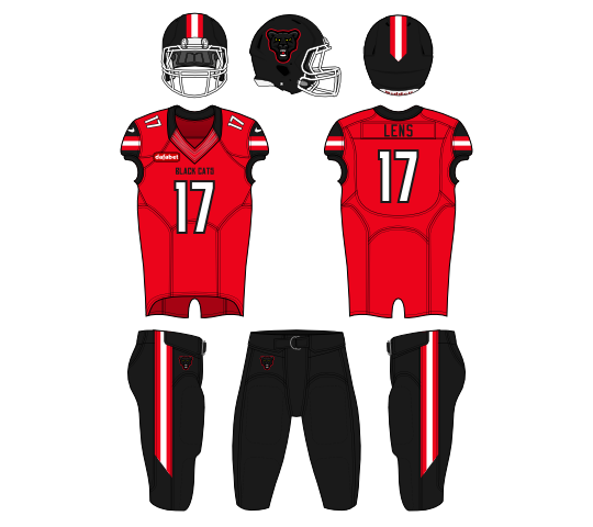
The worst team in the league are nicknamed the Black Cats. Their logo has two panthers on it, so it was a good indication of what kind of logo I should make. The biggest issue was all the dark shades of black, which really was hard to see at times.

The kits are a hodge podge of classic football designs, with some sleeve stripes and a simple helmet stripe, I did my best to both stay true to Sunderland, and different from the other red and white teams I made.

Update: Gave them black pants to separate from Southampton


Wednesday, September 16, 2015

Footy as Football - Manchester City

City is probably(by far) the best team in England right now.

So to separate from the other "Eagles" team, I went with the Citizens. But I still felt an eagle would be the best logo option. The one from the crest is gold with a black outlines, so I did my best to add some lighting and shading. My favorite part of the series has been doing all these animal logos I never have been able to with soccer logos.

With these City kits, I went with a little more balance than the current ones. The light blue is the main color, but I used a lot(a lot) of black and white. Something more gridiron football like, and less what City actually look like.

Update: Added a lot more black to darken the look


Monday, September 14, 2015

Footy as Football - Chelsea

The best team last year, may be the worst team this year, but I still support them!

So a lions head was obvious, and I just had to make it Chelsea like. So I went with a blue lion and a white outline to tie it to the lion on the crest now. I used some light blue which is also on the lion in the logo. Same with the red tongue. 

The kits are head to toe blue, much like the current look. I wanted some accent color, so I did some red stripes on the white cuffs and collar. The red continues to the stripes on the helmet and pants.


Tuesday, September 8, 2015

Footy as Football - Tottenham

I had this sketched out very early on in this series.

For spurs, I wanted to keep the rooster theme, but make a more dynamic looking logo. I went with a sharp foot with a spur on the leg. I thought the foot would look really nice on a white helmet, so I designed it with the helmet in mind. The script is the Atlanta Hawks (old?) script, and I use it throughout.

The jerseys mock the kits in real life. I went white on top, navy on the bottom. I even through in some yellow to resemble the kits they've been wearing. The sleeves also feature a sash looking stripe, to mirror their current kits.


Sunday, September 6, 2015

Footy as Football - West Ham United

The future tenants of the London's Olympic stadium better put some goalposts in!

So this was one of the first logos I sketched for the series. I wanted to have a hand holding a hammer, specifically the ones on the West Ham crest. I know the hammers in the crest are longer, and not the same as one you'd buy from Home Depot, but this series is completely fake as it is. I really like the claret and light blue, so these shades are slightly different than the ones Aston Villa use. The uniforms mirror what West Ham's kits look like traditionally, and the colors feed off each other to balance it all out.


Friday, September 4, 2015

Footy as Football - Southampton

Every one's favorite south coast team is next. 

Southampton is known as the Saints, so this was an easy concept. I thought up a logo with an S and a halo. The logo would be really easy, and their crest has a halo, so it wouldn't be far off from the current look.

I tried their best to incorporate their white stripes into the set without actually doing white vertical stripes. The black gave me a lot to play with to balance the red and white. Thick black lines on numbers and wording really pops off the red.