Showing posts with label CCSLC. Show all posts

Thursday, March 10, 2011

Seattle Grinders

Fantasy baseball concept! I updated an old concept of mine for the fantasy league I'm in. I composed a legitimate primary logo, instead of just a mug. I put a script on it! The script is slanted like many baseball logos are. I thought brown and green would look great for something Seattle and coffee related. Not much to say really. ENjoy it.

Sunday, August 22, 2010

Florida Orange

So my good friend entered his name into a fantasy application for a basketball team. I crank logos out as you know, so its no biggie that I had this.

His team is the Florida Orange, just one, and he only had one idea for a logo. I went to his house(we know each other IRL) and I drew out what I thought he meant when he told me about his idea. I drew the kinda logo you see below. An orange with part cut out, then basketball stripes or whatever they're called. I typed out the team name, then slanted it. I thought it looked really cool, so did he. I beveled the name, then added a FO logo for fun.

The jerseys are based on two former NBA set ups. The first two are based on the Milwaukee Bucks' jerseys back in the day. The alt is my idea, a retro jersey based on the Atlanta Hawks' 70s get up.


Comment, por favor.

Sunday, July 11, 2010

Seattle Emeralds

Sup?

My friend New.Era. relocated his fantasy basketball team from Kansas City, to Seattle. I was looking to do a concept, so I took the liberty of doing this for him. He settled on the name emeralds, being that Seattle is the emerald city. The primary is roughly based off the Sonics' logo from the 80s. With the skyline, and Mt. Rainier it ties into the city. The alt logo is the space needle with S and E in the shape of an emerald. I decided to do something fun with the scripts by cutting them in half.

At first, I had a white, green, electric green version of the home and road you see below. He thought electric green was recognizable enough to make it the home. Then he said the Alt should be a white throwback to the former team Seattle 67s in the league we're in. This is also my new logo template! How you like it?


Wednesday, March 24, 2010

Seattle Grinders Baseball

Some fantasy logos for anyone who reads this. So my pitch to the UBL for the new owner application was the Orlando Juicers. Then Logoman unleashes his concept fury, and I decided to rename my team so I wouldn't be called a thief or anything.

So my new team is the Seattle Grinders, for the city being home of Starbucks. Simple logos for this concept. The primary is the team name above a coffee mug, with baseball stitches in the drink. The cap is an S with the Space Needle. And the cabin of the needle is suppose to be a coffee bean. Jerseys are simple, nothing special just working with a new template.


Bon appetit!

Saturday, March 6, 2010

Orlando Juicers Concept

Quick concept here. I signed up for a fantasy basbeall league on the CCSLC message boards. My pitched team was the Orlando Juicers, which was based off of the old WBL team.

The name has a double meaning. Juicers for the Orange juice, and the scandal in baseball. The cap logo is OJ, like orange juice! I made a diamond logo, because my favorite team is the Rays. Added pin stripes to fill up space, and when I do my jerseys, they will have pinstripes. The scripts can be seen on a prieview of the jerseys. Enjoy!

Comment.

I have some college football concepts for you guys. Come back to see!

Thursday, January 21, 2010

Longo face logo


Sorry guys, school baseball and my girlfriend. 3 reasons I haven't done much postable* concepts.

On the boards, one of the best designers is offering free design help. Tutorial 1 is making people like logos. So if you wanted to do a head of a gladiator, this is how you would do it. He told people to take a random celebrity, follow his steps, and post the results. Here's my shot. Obviously, it's Evan Longoria.
I'll post these for a while. I don't really have much, but I might post a random crap post. Stay tuned

*Postable as in, I'm 20 into a 32 part concept series. I'll be done shortly. Prepare yourself.

Saturday, December 26, 2009

Another Fantasy Hockey Identity


Hey gang, and Happy Holidays!

So this guy in the BayMen's league didn't really have an actual logo set. He just used an outline of Alaska, with the big dipper stars inside. So I offered to do him a logo set.

I was messing around with colours, and stumbled upon this beautiful scheme. I'm a sucker for 2 shades of brown. But I just threw some elements together, because all he said was he wanted was an outline of Alaska with the stars, so I did it. Here's the logos.

I decided to put the Alaska flag in there, so I could put it as a shoulder patch in the jerseys. They have an older style, just stripes and stuff. The number font matches the script. Hmm nothing that crazy. Enjoy!
So C&C please!

Saturday, December 19, 2009

San Francisco Bay Men Identity

Here's the identity of my new fantasy hockey team I took over recently.

Alright, first off, props go out to Firefly for the original set, which I updated.

I chose the colours based off a few things. Navy, and aqua for the water, and orange which is for the Golden Gate bridge, and the Giants. The primary logo is Firefly's logo, updated with my colours and script. The SF alt is based off his, which had SF on an anchor. I did the same. Not really much to say...

I went with a non RBK edge cut with the jersey, and kinda made up a design. I call the alternate, the Golden Gate alt. I call it that because It uses the bridge logo, and the orange colour. The partial logo is the main logo on the crest.


So how'd I do? Comment below.

Thursday, December 3, 2009

Jacksonville Captains

So a friend of mine wanted me to do a fantasy set for a team on the CCSLC boards. The team is the Jacksonville Captains, which he made up. Not much to explain about this concept, so here it is.

I'm actually in this fantasy league. I took over a team that was 3-17 last season, and of right now, I'm 5-0.

Well that's all I have currently, I'm working on some more NCAA concepts, and another fantasy set, but this one is for me. I also am working on and off on a project set to come out this summer. Just you wait.

C&C

Monday, November 2, 2009

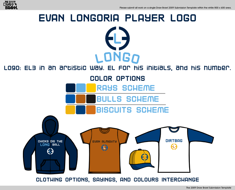
CCSLC Competition: Player logo

So I entered a competition on the boards where you designed player logos. I did my favorite player, Evan Longoria. It's self explanatory. Click the link under for a white background.
So how'd i do? Comments are below.

I'm working on some NFL concepts for you all, so check back! I also have some fan art coming!

Saturday, June 27, 2009

Trifecta Competition: Final round

So with my Tide concept, I advanced to the final round of that competition. You had to do logos for a team that's identities are solid. (ie. Packed, Leafs, Yankees) I chose the Red Wings, and this is my result.

I added 2 new colours to the teams pallate... maroon, and gold
I kept the idea of a winged wheel, but updated it. I made new wings, and the wheel is 3d compared to the 2 d one they use now. The secondary is a simple winged D. The tertiary is one that I really like. It's a patch that says Hockey Town with an Octopus. Then the script is a modified Aachen.The jerseys are different from the current ones. I made sort of a pre-edge design. The alternate is based off this past year's Winter Classic jerseys. I put the D logo as the crest as opposed to the Old english D they used.

Sunday, May 31, 2009

Trifecta Competition

Gah, I've been waiting to post this forever. The competition was to take a city without a franchise in a major sports league and make a team. I entered as the Tampa NBA team. The top 2 concepts advance to the final round, and I actually think I have a shot to do this.

I never do basketball concepts so this was a dificult one. I looked at NBA logos for inspiration, and worked them into my concept.
The team is the Tampa Tide, because Tampa is on the water, and water has tides. I used a beach-y colour combo, with navy, light blue, sand, and orange.
The jerseys are pretty simple. I made a sand alternate for sunday home games. I also but the players names under the numbers, like how the allstar jerseys are.
So can I get C&C on this? Hope I get to do another concept for you guys.

Saturday, January 10, 2009

My NAKA team

On the boards, a competition was started. It was create, and brand a kickball team. So I entered, and I came up with a concept, that HAS to be my favorite concept I've ever done. I named my team the Tampa Blaze. Tampa means "sticks of fire" in the calusa language, and I referenced it. It also is a play on Tampa Bay. I actually sketched my first sketch of the logo in like 5 minutes, and went on the computer, and finished my set in like an hour. So heres my concept!I couldn't show you guys this for the longest time, but voting started today, so I guess I can now. I'd also like to mention, I have recieved votes for this!