If you want to see a certian team done in the RtMlB series, leave a comment below.
Or if you have an idea for a logo, email me what you think.
I also plan on having a Tournament of Logos for the RtMLB series logos
Thanks for the support.

Tuesday, September 30, 2008
Wednesday, September 24, 2008
NCAA Redesign: UNLV
Hey guys, sorry I didn't post yesterday, i had to do a project for school. Anyway, I worked up a redesign for UNLV. The jerseys they have now, are...stupid looking. So I made a Jersey, that looks a lot better. A weird kind of template I used. So what do you think about my design. Leave a comment, or send in your concepts. Ill have something for tomorrow.
 A weird kind of template I used. So what do you think about my design. Leave a comment, or send in your concepts. Ill have something for tomorrow.
Monday, September 22, 2008
Indy Colts Rebrand
Hey everyone. Today's post is a rebrand for the Colts. Their logo is really boring. So I jazzed it up some...with silver. Not a HUGE upgrade, but it helps. I cant stand teams with 2 colours. Its so plain, and you can't expand on anything. So I added an alternate logo, originally designed by cward. So heres the logo set. Like I said, it isn't a huge rebrand, but it looks good. So there's the logo set, and heres the jerseys.
 I kept the sholder stripes, and made the jerseys modern. Well thats all I have currently, I plan to do a UNLV redesign later, so come back. What did yoou think of my design, leave a comment. Or Email me.
 Like I said, it isn't a huge rebrand, but it looks good. So there's the logo set, and heres the jerseys.
 I kept the sholder stripes, and made the jerseys modern. Well thats all I have currently, I plan to do a UNLV redesign later, so come back. What did yoou think of my design, leave a comment. Or Email me.
Sunday, September 21, 2008
My ideas for NHL 3rd's
Recently, a few teams have reveled their new third jerseys. Those teams are the Hurricanes, Bruins, Sabers, and Blues. I really like the Sabers one. Well the ones in the links were all pretty good ideas. Some thirds just seemed like a bad idea all around. I'm mostly speaking about the Lightning, and Senators. So I made a third jersey concept for them. First off here's what the Lightning are planning on wearing.  Looks pretty good, and I don't think anyone here in Tampa would complain about that. But when it comes to Lightning third jersey, nothing tops the first one. I have a poster of Vinny Lecavalier with him in that. Speaking of teams planning putting their nickname on their jersey. The Senators with "SENS" across the front.
 I don't understand why people don't like that logo, it looks really good. Well that's all I have for now. I'm planning on doing a Colts rebrand tonight, or tomorrow. So check in later. PLEASE send in your concepts. They'll be posted. Thanks to Chris at Icethetics for the descriptions of the jerseys
Also completely different. The Lightning will introduce a predominantly dark-blue alternate with the word "BOLTS" angling downward in white on the jersey front. A narrow white stripe is featured above a broad black stripe at the uniform base. Grey and white stripes are on each arm, and the latter half of the sleeve, to the tip, is black.Me being a Lightning fan makes it even worse. I'd love to see the Lightning wear a blue jersey, but with the alternate logo. So with that in mind, I made what the third should look like.
 Looks pretty good, and I don't think anyone here in Tampa would complain about that. But when it comes to Lightning third jersey, nothing tops the first one. I have a poster of Vinny Lecavalier with him in that. Speaking of teams planning putting their nickname on their jersey. The Senators with "SENS" across the front.
A dramatic change in the Senators' third jersey will see a predominantly black uniform with the word “SENS” angled upward on the front. A fashionable red stripe will run from the arm pits, down the side of the jersey, to its base, where the stripe turns inward. A pair of narrow red and white stripes will adorn each arm, and the very bottom of the jersey. It's quite a sharp design. Pretty bad.What if the Canadians put "HABS" across the front. Montreal would riot, and Quebec would break away from Canada. I don't think ANYONE likes the idea for the Senators. So I made a concept for them.
 I don't understand why people don't like that logo, it looks really good. Well that's all I have for now. I'm planning on doing a Colts rebrand tonight, or tomorrow. So check in later. PLEASE send in your concepts. They'll be posted. Thanks to Chris at Icethetics for the descriptions of the jerseys
Saturday, September 20, 2008
NCAA Redesign: Boise State
Today's installment of the redesign series is every one's favorite underdog, Boise State. I was actually at our friend Kevin's house when they beat Oklahoma. Some people don't like their Denver Bronco like uniforms. I do to, they're getting kind of lame, but I wanted to keep the type of feel of them in the uniform. So I used The template that the Hamilton Tiger-Cats use, and it looks pretty good. It came together quite good. I might make another redesign before tonight, if I do, it will be UNLV. So Check it out. If you want me to do a redesign for a team, or a rebrand, leave a request. So email your concepts.
 It came together quite good. I might make another redesign before tonight, if I do, it will be UNLV. So Check it out. If you want me to do a redesign for a team, or a rebrand, leave a request. So email your concepts.
Wednesday, September 17, 2008
My CSFBL Franchise
Well, a few months ago, I joined a site called the Computer Simulated Fantasy Baseball League. You make a team, and you play others teams. I joined, and did really good. Its the Inagrial year of my league, Beta Alpha Alpha Phi, and my team did really good. We finished 2nd place in my division, by 1 game. So I put together logos, and a uniform set. My team name...the DC Nine. Logo made by Slapshot. So with every logo here, there's a uniform set
 Pretty Snazzy. Thats also a paint compatable template I made. Right now, my team beat pour rivals the La Corsse La Crossers 4-3, and is moving on to the next round. The only thing that is bad is, you cant do a season with under 16 owners(you can leave teams). The league has 6. I do have a back up plan. I already made another team. So when the Nine are deleted, the new team will get the name. So thats it for right now. I'm nearly done with a rebrand for the Colorado Rockies. Im just trying to work on a new logo, because I can't curve the letters on paint. So come back for that tonight, or tomorrow. Be the first to send in your original concepts. They'll get posted
 Logo made by Slapshot. So with every logo here, there's a uniform set
 Pretty Snazzy. Thats also a paint compatable template I made. Right now, my team beat pour rivals the La Corsse La Crossers 4-3, and is moving on to the next round. The only thing that is bad is, you cant do a season with under 16 owners(you can leave teams). The league has 6. I do have a back up plan. I already made another team. So when the Nine are deleted, the new team will get the name. So thats it for right now. I'm nearly done with a rebrand for the Colorado Rockies. Im just trying to work on a new logo, because I can't curve the letters on paint. So come back for that tonight, or tomorrow. Be the first to send in your original concepts. They'll get posted
Sunday, September 14, 2008
Turn Ahead the Clock NHL
So on my favorite blog, Icethtics, Chris would post crazy fan art. Recently he's been busy, so he hasn't been posting any art. It was one of my favorite series. So I was thinking "How can I help bring it back?" So I thought of the MLB's Turn Ahead the Clock nights. I remember the tackiness of the uniforms. So I whipped up some concepts for the teams mostly favoured on Icethetics. The Canucks, Sabers, and Leafs. They turned out pretty tacky(in the good way).Here's my Canucks. I was going for the wrap around look on the D-Backs jersey. Next I made a Sabers jersey. The buff-a-slug(I hate calling it that) seems to work on it.
 Last is a Maple Leafs jersey, that if the Leafs would wear in real life, there would be a riot in Toronto.
 Looking at them, now that I think about it. Is it really that different from what the NHL did in the mid 90's? Man I'd like to own that jersey. So that's what I have for today. Tell us how you feel about these...eyesores...in the comments. Or write us an email. Send in concepts, probably a post tomorrow. Check in later.
 I was going for the wrap around look on the D-Backs jersey. Next I made a Sabers jersey. The buff-a-slug(I hate calling it that) seems to work on it.
 Last is a Maple Leafs jersey, that if the Leafs would wear in real life, there would be a riot in Toronto.
 Looking at them, now that I think about it. Is it really that different from what the NHL did in the mid 90's? Man I'd like to own that jersey. So that's what I have for today. Tell us how you feel about these...eyesores...in the comments. Or write us an email. Send in concepts, probably a post tomorrow. Check in later.
NCAA Redesign: BYU
Yesterday, BYU DESTROYED UCLA 59-0. BYU has solid uniforms. But I was thinking, shouldnt there be gold in their uniforms? Since most of their logos have it. So I whipped up a concept with gold. Hope you like it. I based it off the jerseys they have now, but added some logos, and gold. So thats what I did this morning. There might be a post later. So stay tuned, email us your concepts. They'll get posted.
 I based it off the jerseys they have now, but added some logos, and gold. So thats what I did this morning. There might be a post later. So stay tuned, email us your concepts. They'll get posted.
Friday, September 12, 2008
New England Revs Rebrand
The New England Revolution are one of the original members of the MLS. They've had the same logo since '96. Some people like it, I think they could do better. So I decided to make a rebrand of them. It turned out really good. My dad really likes it. It turned out really classy. The secondary logo is a map of New England. IM just watching the USF Bulls game. I our friend Kevin is at the game. Email us your concepts. Or send us questions, comments, and sarcastic remarks. Comment this post bellow.
 It turned out really classy. The secondary logo is a map of New England. IM just watching the USF Bulls game. I our friend Kevin is at the game. Email us your concepts. Or send us questions, comments, and sarcastic remarks. Comment this post bellow.
Tuesday, September 9, 2008
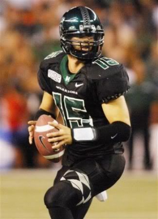
NCAA Redesign: Hawaii
Last year, Hawaii had an undefeted regular season. But this year, they lost their Coach, Star QB, and uniforms. Well, I redesigned their new uniforms, which are the same as USF's new ones . Their uniforms look pretty good. I did this before I knew what they looked like. But heres my design. I tried to add some tribal striping like the old unifroms had. It turned out good. What do you think?Comment bellow. Send in your original concepts. They'll get posted.
 I tried to add some tribal striping like the old unifroms had. It turned out good. What do you think?Comment bellow. Send in your original concepts. They'll get posted.
Sunday, September 7, 2008
My OKC Thunder Uniforms
Yesterday, I posted my design. I said I'd make jersey's so I did. I edited my football template, into a basketball template. Kinda quick, and simple, but it looks good. I based it off the 76ers jerseys. So send in concept art. Recommend us to your friends. Lets make this site huge.
 I based it off the 76ers jerseys. So send in concept art. Recommend us to your friends. Lets make this site huge.
Nascar Concepts
I have thins Nascar computer game. It allows you to edit, and make your own cars. I've had this game for a LONG time. Obviously I have some cars. So I took a screenshot of a race, to show off the cars. Pretty cool huh? If you want to see a car close up. Comment below, and i'll post the car up close. Or send me your car design ideas, and I'll put it in the game. Oh, and the graphics are kinda bad, due to the fact the game was made in 1999.
Heres the numbers and sponsors:
1st: #32 Total(French Oil Company)
2nd: #6 Subway
3rd: #83 XM Radio
4th: #97 Rip it(energy drink)
5th: #70 7-eleven
6th: #10 Axe
7th: #21 Firedog
8th: #20 Circuit City
 Pretty cool huh? If you want to see a car close up. Comment below, and i'll post the car up close. Or send me your car design ideas, and I'll put it in the game. Oh, and the graphics are kinda bad, due to the fact the game was made in 1999.
Heres the numbers and sponsors:
1st: #32 Total(French Oil Company)
2nd: #6 Subway
3rd: #83 XM Radio
4th: #97 Rip it(energy drink)
5th: #70 7-eleven
6th: #10 Axe
7th: #21 Firedog
8th: #20 Circuit City
Some changes...
I was thinking, and decided to delete some posts. If they were just recolourings, not actual concepts, I deleted them. So that means, if you send in a concept, that's a simple recolouring. It won't be posted. That's all. Ill have some new concepts up later. Stay tuned
Saturday, September 6, 2008
OKC Thunder Redux
Well this week, the NBA's newest team, the Oklahoma City Thunder, unveiled their name, logo, and colours. Well they messed up. They definately could've done better. So because I can, I made a rebrand. I like it A LOT better. I hope you do too. Like the new format? The middle logo is an OKC. Ill have Jerseys sometime in the future. I just need to find a good template. So comment it, send in your concepts.
 Like the new format? The middle logo is an OKC. Ill have Jerseys sometime in the future. I just need to find a good template. So comment it, send in your concepts.
NCAA Redesign: Oregon State
Hello once again. Today's redesign is Oregon State. Last year they had jerseys nicknamed the sports bra. I actually kinda liked them. But this year they changed to a plain jersey. I dont like that. So I made a concept, I like it. They look pretty cool. So comment...if you read this. Send in your concepts, they'll get posted.
 They look pretty cool. So comment...if you read this. Send in your concepts, they'll get posted.
Thursday, September 4, 2008
NCAA Redesign: Indiana
Hey, Today's instalment of my NCAA redesign series is Indiana. I was searching for the worst college football uniforms. Someone mentioned Indiana's, and how it looks a lot like Oklahoma's. So I thought Why not. So here it is. I used a template based off a football jersey I have. I kinda dig it. Mostly because I made it, but whatever it looks cool. Subscribe to my blog. Or send in concepts. Ill have a concept for tomorrow. Stay tuned.
 I used a template based off a football jersey I have. I kinda dig it. Mostly because I made it, but whatever it looks cool. Subscribe to my blog. Or send in concepts. Ill have a concept for tomorrow. Stay tuned.
Wednesday, September 3, 2008
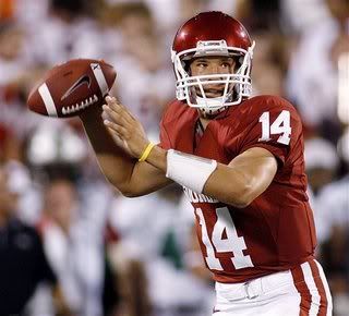
NCAA Redesign: Colorado
Hello once again. This installment of my redesign project is Colorado University. The got new uniforms for this year. It has like bumps I guess on the shoulders. Kinda tacky.So I did another template made by Ian Bakar. Turned out good. Can someone PLEASE send in concepts. I'll post them
 Turned out good. Can someone PLEASE send in concepts. I'll post them
Tuesday, September 2, 2008
NCAA Redesign: Oregon
Who didn't see Oregon coming in my redesign series. I really like piping, rather than old school, 1 stripe stuff. But Oregon's uniforms are ridiculous. The thing that makes it worse, is that the uni, pants, and helmet are interchangeable. I just did the math, 48 uniform combinations! The steel plate shoulders really suck too. Nike is lame! So my design, I toned it down, sorta, and used a jersey template designed by one of my favorite designers, Ian Bakar. I think it turned out pretty good. I actually sorta like those pants, it looks like something Nike/Oregon would use. So that's what I have for now, Next will be a concept for Colorado, either tonight, or tomorrow. Can anyone send in concepts. They'll get posted for sure!
 I actually sorta like those pants, it looks like something Nike/Oregon would use. So that's what I have for now, Next will be a concept for Colorado, either tonight, or tomorrow. Can anyone send in concepts. They'll get posted for sure!
Monday, September 1, 2008
NCAA Redesign: NC State
Today, my redesign is my Dad's college, NC State. The last few years, they had a Falcon type uniform. This year they changed to a boring plain red jersey...trust me. So I made a completely new uni, and it turned out really good. I really like the dark uni's. If your wondering why I didn't use coloured pants, think red pants, ew. So if you have an idea for a redesign, email Mykl at mtbuc@aol.com. Ill give you the template. But when you save your design save it as a PNG file, it comes out smooth, not pixelated. My next design will be the U of Oregon.
 I really like the dark uni's. If your wondering why I didn't use coloured pants, think red pants, ew. So if you have an idea for a redesign, email Mykl at mtbuc@aol.com. Ill give you the template. But when you save your design save it as a PNG file, it comes out smooth, not pixelated. My next design will be the U of Oregon.
Subscribe to:
Posts (Atom)