Sunday, July 27, 2008

AC Vancouver

I said before, Steve Nash is part of a group that is trying to bring a MLS team to Vancouver. So I made a Logo, and kits for my team called AC Vancouver. instead of using FC, I used AC. Basicly the same thing, but it AC stands for Athletic Club.I used Black, Turquoise, and Silver. The MlS need some new colours(My next will be purple). So here's the logo I made.I actually really like it. The colours just seem to work, and the logo comes together nicely. As I always do I made Kits.I used the Trinidad, and Tobego Kit from the 2006 World Cup. I used EA as the sponsor, because EA is based out of Vancouver. That basiclt Wraps it up. Wow 3 Canadian Posts in a row! Thats crazy.

CFL Expansion: part 2 of 4

They're back. The Ottawa Rough Riders are back...not really. They folded due to losing seasons, poor ownership, mismanagement, and decreased fan support. Ottawa Got a team back in 2002 called the Renegades(my fantasy team name is the Ottawa Renegades, lol), but they folded in 2005.Like I always do, I made a jersey. I used influences from the old Rough Riders(helmet, and pants), and the Renegades(jersey).The pants are really white, not light light grey. So tomorrow I'll have teams from Quebec City,, and Victoria. Also I got my Coloumbus Blue Jackets logo posted on Icethetics

Saturday, July 26, 2008

CFL Expansion: part 1 of 4

I came across a topic about the CFL on the sportslogos.net message boards. They were discussing possible CFL expansion. I've had this idea for a while of a 12 team league with 6 teams in each conference. The CFL has 8 teams now, and a 9Th on the way(Ottawa), and so for my idea to work i need 4 teams. Ottawa, Quebec City, Atlantic Canada in the east. Victoria in the west(while moving Winnipeg to the west). So since I can, I made a Team. The Atlantic Schooners. They were originally going to be from Halifax in the 90's, but didn't have a big enough stadium. So I just brought back the logo.. With that, I made a home jersey. That's basically the standard for CFL Jerseys. I may be from Florida, but I follow the CFL. Every Saturday, a game is on, and I try to watch it. Also when I get older I want to move to Toronto, or Vancouver. This is Mykl btw. So that was my take on the Atlantic Schooners. Ill have new one tonight, or tomorrow. I plan on bringing back the Ottawa Rough Riders. Its funny, cause the CFL had 2 Rough Riders in the same League for 86 years. Nothing is better than a Rough Riders vs Roughriders game(they are spelled different.

Sunday, July 20, 2008

Bringing back the Miami Fusion

Shalom in the home everyone. I said earlier that I'll work on a soccer concept. So I realized that Our home state Florida doesn't have a team, and lots here are soccer crazy. Mostly the Latinos. So i brought back the ole Miami Fusion. I did a logo and a kit. So here's the logo The old logo, had a M and the sun effect going, so I worked them in. Next I have the kits. I used the Danish Euro 08 kit. With numbers, and socks from the Saudi World Cup kit.Cool. I LOVE making soccer rebrands, Ill have a lot more coming soon, stay tuned.

Monday, July 14, 2008

MLS Philadelphia

Well, unless you follow the MLS a lot, you wouldn't know that the MLS will get 2 new teams in the next 2 years. 1 the Seattle Sounders who will start next year(owned by Drew Carey), and a team in Philly in 2010. The Sounders have shown their logos, and unis, but Philly hasn't announced anything, so I made up a concept logo, and kit for Philadelphia FCI used the Eagles (darker) green, and the Flyers orange. I like it it has a English feel with the stripes. So there's the logo, and whats a team without kits(soccer terminology rules!) I used the Argentina kit from the 2006 World Cup in Germany. So if you like my designs, comment bellow, or you can email us your designs.

Wednesday, July 9, 2008

The Other Football

Hi everyone, today I'm posting my first soccer art work, since it is 3rd in the poll for the first logo tournament. So i made new logos for the MLS teams without shield type logos. First off, is a Kansas City Wizards logo, that I did twice because i accidentally saved over it with my Columbus Crew logo coming upI made a shield and Incorporated their old rainbow soccer ball logo in it, and most teams that won a championship put stars in their logo, and KC has won 1 championship. Next, this logo has stars, because their patriotic, not because they won anything(they lost in the finals last 3 years), New England Revolution.The logo they use in real life is just an American flag, drawn with crayons. Last when you see the Columbus Crew logo, what do you think...I think of Devo in their hats. Anyone? So i just made a new logo, with the Columbus Skyline.Its better than the Devo logo. So that's all i have for today, I think Kevin's gonna get the rests of the posts this week, cause hes going out of state for a boyscout thingy. So next week, its all me. Any comments, questions, sarcastic remarks? Comment bellow, or email us. Mykl out

Monday, July 7, 2008

NFL alternate logo concepts

Today i have a few alternate logos for NFL teams, first ups is a logo for my team, the Bucs I like it as an alternate., always thought they should do something like this. Next is a Jets logo that actually has a jet in it.

Kinda Plain(Pun intended) but its better than this.Lastly is every ones favorite team with numbers in their name...you guessed it 49ers. I think it could be an alternate when they move to Santa Clara.Well that's all I have today. Ill work on some art tomorrow, for Wednesday cause Kevin's day is tomorrow. Email us your designs.

Saturday, July 5, 2008

NHL designs

Today I have some NHL concepts. First I changed The alternate Columbus Blue Jackets logo. From a hat to a cannon.
The Blue Jackets is a reference to the Northerners in the Civil War, not a blue hornet(like a yellow jacket). Unlike their first logo. Next I hear a lot of Oiler fans hate the new jerseys, because the stripes seem to stop. So I just changed the colour of the sleeve stripe.Then I have a Vancouver Canucks jersey with out the city name on it.
That's all the concepts I have for today, email me yours.

Wednesday, July 2, 2008

Revising an Astros logo

I've been reading comments of retro logos on Sportslogosnet, and I noticed that many Astros fans like the old logo, but they would like to see it updated with the new stadium, they have been answered.I like this a lot. Kinda selfish but I think I really did good. If you have comments, comment bellow, or my email is found on the right side of the page.

NHL concepts

Today I have some of my hockey concepts! First I have a Ducks jersey since no one can stand the one they have now. I think its an improvement. Compared to those tacky stripes that swoop across the front of the jersey.Then I have a Calgary Flames Jersey that is toned down from the jersey they have now. 
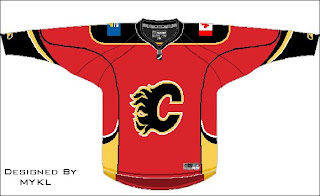
Lastly I have a Chicago Black hawks Alternate Jersey that's is very modern featuring the Alternate logo That's all I have for now. I'm working on some baseball logos, probably some recoloured stuff. I might post some art from my friend Kevin. So check in every once in a while. Any comments, questions, sarcastic remarks you need to tell us? My email is shown on the right side of the page, or comment below.