

Monday, December 26, 2011
Final FSU Concept
Tuesday, December 20, 2011
2013 Winter Classic
I finally did something that I've had in mind for a long time!

So here is a concept for an all Florida Winter Classic. Obviously, it's a joke. The weather down there for New Years is about mid 60s, and Raymond James Stadium hosts a bowl game on New Years Day! But one can dream.
I took the Winter Classic script from the last 3 years, and some aspects over the years with the snowflakes, NHL logo, and puck. I did a beach scene, and a palm tree for the area, just for cliche effect.
The jerseys were the best part, and they were just silly. The Bolts' set is an old alternate I made last season with the Habs' stripes with Tampa Bay on the chest. The only difference is vintage white. The Panthers set has old 1920s stripes, and beige pants. I didn't want to do a throwback for Tampa, and Florida doesn't have that much of a vintage history, so Faux-backs will do!

Saturday, December 3, 2011
Florida State alternate logos
Here is some other logos.
Still working on the face, I'm working on the bacon face, and trying to make the face paint not look thrown together. Here are two alternate logos, and a script while I'm working. I'm going to make the feather on the Osceola logo match the one on the spear. I used some spear logos, the two official logos, and the nike spear. I wanted to update the logo from the link below, and thought of doing this with a state outline.

Two things I'm considering keeping as is, just as a personal opinion.
- the colors
- rotation
I seriously hate the way the football uniforms look. Personally the gold pants looks like watered down champagne, and I'm pretty sure they don't match the helmets. If I get in, the in the top 3 things to do is order this shirt. I love the colors. I wanted to originally use the Predators gold, but figured gold was too set in the history of the school, and the colors would be similar to the Gophers. I lightened it, and sort of made it into a "honey mustard" color. I like how it looks on the logos, but might change it when I do work on the football uniform, to make it a little more gold.
And I'm still leaning for the downward turned head. I see it as charging into battle, instead of looking up to the skies. Not sure, that's how I look at it.
Wednesday, November 30, 2011
Our new look
I thought that it would be really cool, if I made every part of my design umbrella have similar designs. I was looking to make a logo for myself that I could brand my logos, and make a portfolio(which I linked!) So a few days after I made the M logo, I realized how much better I could make Sports Logo Spot, and Stadia Arcadia look, especially if they were the same look.
I knew I could update Stadia easy, I would make a logo of an arena, like the old logo. I did that, loved it, then went to work on this blog's new logo. I settled on a pencil, reworked it to make it perfect, and finished. Then I wanted to make icons for them for the sidebar. I made a facebook one for the page, then I was making my last one, the one to my twitter.
Inkscape crashed.
I had to recreate every stupid logo. So I made these all twice! So that's a back story, I like it, but I'd love to get some reader(s)...(?) reactions.
What I've been up to!

So if you didn't know yet, I'm a senior in high school. The place I want to go to is Florida State, too bad I hate their current set. I would suck it up for a good education, but c'mon! Chief Osceola is pretty bad if you look at it. Since about Thanksgiving, I've been working on this logo.
I think an update is something they should look into, so I can buy many things with the logo on it. Personally, I think the Nike logos they made are better. So I envisioned a logo, which will be an alternate, and wanted to do a rebrand. I chose the current garnet, black, and a color halfway between Vegas gold, and Predator yellow. They have many different colors, and I wanted one set scheme. The logo I was most pleased with was Chief Osceola. He needed a facelift, because the current is just cluttered. I gave it facial features, like a jaw line, and nostrils. Anything to make it more person like. The feather is an actual feather too. I tilted the head down on my first update to make it seem as if he's charging in an ambush, or something less racist.
So I'm still working, but I wanted more than one post this month.
So I'm still working, but I wanted more than one post this month.
Tuesday, November 15, 2011
Steve Yzerman's NHL: Dallas
Dallas Stars
I really like their current logo, but I do think it is slightly outdated. That is what I wanted to do, update and simplify. Obviously an all green look would look great, and be a faux throwback to the North Stars, while the logo breaks away from that.
Just messing with the current, I made the gold part green, and the green part white. it actually looked real nice. Kind of what I was looking for, simplicity in the star. This is the first one that will actually be able to work in green and white. They don't have a good alternate, so since they're the only team in Texas, they get a Texas outline. The other alt logo is a circle logo which just kind of ties together all of the logos.

I love when jerseys don't have hem stripes while their sleeves do. The jersey looks really nice in my opinion. I wanted to do that sometime, and figured Dallas was a good opportunity since they don't have them now. Pretty simple, I guess. Monochrome green with the same font on the script.

Still planning on doing more.
Wednesday, October 26, 2011
Steve Yzerman's NHL: Los Angeles
Los Angeles Kings
I've always thought that the crown logo was overcluttered. Then they release the new set and it is such a step down logo wise. To me, the Kings never have really had a logo set that I truly love. I went out to work on that stat. Just like the Sharks and Lightning, I had to make it simple and bold.
Instead of making a logo from scratch, I thought the crown's shape was just what I wanted. It was just how I'd use it. I changed the points, even though it all looks slightly the same. Instead of circles, I used diamonds. I thought it looked more like jewels. I just went with what will get the look across that it is a crown, without being too out there with it. Simplicity is the key. I needed an alt, so i just went with the shape they used for a time with a similar color scheme. I also introduced a new script. The same is found on the numbers, which you will see.

On the jerseys, I've had this idea the whole time. The Habs' look is great, and could be used again. With this, it makes the logo pop out, and the white's contrast on black makes the look sharp. I DID decide on monochrome for this one, so calm down. The white is just a white version of the home, so nothing crazy.

Sunday, October 23, 2011
Steve Yzerman's NHL: San Jose
No secret I loved the original blue and white Lightning set. I think with some tweaks, my team might be one of the best looking in the league.
Anywho, I thought it would be fun to piss everyone off and make some more teams Yzermanized. Just say that word out loud. It's fun. I might do teams from all over time, but I wanted to do some teams that are more modern. I thought it would be kinda fun, and I could work on my logo skills.
San Jose Sharks
No doubt I was going to use aqua. They were my first choice in doing this. I used to really like the current set, but now I keep finding things wrong with it. I love the simple design, and orange. I just used to like them more. The logo does look robotronic, and I'm not a fan of the full body shark either. So I wanted to simplify the logo, design and color wise.
I actually start backwards. Script, alternate, then primary. But I found a font, customized it, and moved on. The alt is an updated fin logo, and it looks like the one I sketched. Love it when that happens. Then the primary got me. I retraced the shark, and changed it up. I got rid of the stick because, you don't do that to your stick! It took me forever to get everything right, I didnt have the white highlight and tried doing things like that, but I ended up just reusing the one from the current primary.

The jersey. They need to be simple. So I did it. Two stripes like the 2008 Canada jersey, that was what I based it off. One major thing... WHITE PANTS. I wanted aqua. But I didn't want to go overboard. So I did something completely stupid, and never worn on the ice. Well, officially. Everything else is by the book. I did put front numbers, but that's the only crazy thing I did with the rest of the uniform.

Thursday, October 13, 2011
San Francisco Bay Men
This is a concept for my fantasy hockey team. I realized how crappy that old set was, and how much better could make it... So I did my thang and made some logos and jerseys.
I did want to keep the same basic primary with the man holding a stick. I retraced it, changed it for consistency purposes. The secondary is my Seals' SF logo inside a boat steering wheel. The font simply matched and is classy looking.
 I wanted sleek looking jerseys, and I felt like I did it. The stripes are used on everything, and I kept it the same on the home and road. The alt is a Canadiens' stripe with the alt logo on the front.


Wednesday, September 21, 2011
Pro Combat 2011: Stanford
Last one. Stanford's logos don't have black. So I'm not sure why Nike wants it to be.
Red and green. Complimentary colors. I did a two stripe sleeve stripe, and to add some more, piping and having the sleeves a darker red. The numbers have little trees in them for effect. Lastly, the pants match the sleeves.

Take notes, Nike.
Red and green. Complimentary colors. I did a two stripe sleeve stripe, and to add some more, piping and having the sleeves a darker red. The numbers have little trees in them for effect. Lastly, the pants match the sleeves.

Take notes, Nike.
Pro Combat 2011: Oregon
Oregon's pro combats were a dark version of the National Championship game set. YAWN.
If you want to do volt, and black. Do something cool. Like me. I put more volt than the number outlines. The duck wings aren't a glossy deal, and the sleeves have the gradient pattern. The pants are a dark grey, and the numbers and helmet are a dark steel pastern. i forget what Nike calls it, but it's not just one color.

If you want to do volt, and black. Do something cool. Like me. I put more volt than the number outlines. The duck wings aren't a glossy deal, and the sleeves have the gradient pattern. The pants are a dark grey, and the numbers and helmet are a dark steel pastern. i forget what Nike calls it, but it's not just one color.

Pro Combat 2011: Ohio State
Am I the only one that hates Ohio State's uniforms? The helmets are shiny, the sleeve stripes are weird, and the pants are matte. No wonder I root for Michigan when they're head to head.
I wanted to do a modern twist. I added piping that ran around the sleeves and had a stripe that hasn't been done before. I made the shells and pants be matte, and gave the numbers two outlines. I tried to remain consistent with the striping on the sleeve pants, and socks too.

I wanted to do a modern twist. I added piping that ran around the sleeves and had a stripe that hasn't been done before. I made the shells and pants be matte, and gave the numbers two outlines. I tried to remain consistent with the striping on the sleeve pants, and socks too.

Tuesday, September 20, 2011
Pro Combat 2011: Navy
I did this before the actual ones were released, but they actually came out VERY similar.
What I went for was to look like an actual navy officer uniform. I gave them monochrome navy, a white helmet, and yellow stripes near the ends of the sleeves. I didn't want the goat logo on here, just because of how sloppy it is. I tried having a balance between white and yellow to keep it looking sharp, and I feel like it turned out like what I was going for.

What I went for was to look like an actual navy officer uniform. I gave them monochrome navy, a white helmet, and yellow stripes near the ends of the sleeves. I didn't want the goat logo on here, just because of how sloppy it is. I tried having a balance between white and yellow to keep it looking sharp, and I feel like it turned out like what I was going for.

Ottawa Senators FC
Yesterday, Tim from the6thsens.com emailed me with a little challenge.
He said that the Senators' new alt jersey looked like a soccer jersey with the chest stripes, and crests. I kind of agreed to that statement, and fulfilled his request.
I had more fun than I should've which is always good. I tried to make it more hockey like. I put reebok logos on it, made the shoulders have a yolk like a hockey jersey. I matched the jersey pants and socks, and put a Canadian flag on the sleeves for fun. Here's my concept.

Go check out his blog everyone. I'm a huge Lightning fan, but I still enjoyed reading some stuff.
Friday, September 9, 2011
Pro Combat 2011: Michigan State
I wanted to have a spartan motif as much as I could. I decided on a cape design over the top, like the old Steelers jersey. Near the cuffs, I put a design like San Jose State, you know. The number and script is custom, and I can show a big version of the script if anyone wants to, but here it is.

Next Pro Combat: Navy

Next Pro Combat: Navy
Pro Combat 2011: LSU
I was looking at images for throwback, and some stuff from the 1959 team that was undefeated. The helmets had numbers, similar to the Eagles, with some modifications, I think I matched it. The jerseys are the same as the current, so I added gold for the typical nike throwback look. The old set had block numbers, but I matched the helmet font. You could say it was a "Feauxback"

Next Pro Combat: Michigan State

Next Pro Combat: Michigan State
Pro Combat 2011: Georgia
I wanted to make atleast one of their sets consistent. By that, I mean the pattern I've come to use for almost every concept the Helmet/jersey/pants alternate colors 1/2/1. The primaries are red/red/silver. One thing Nike has done was use a granite color. I thought that this team would look pretty good using this. As far as the design, I did what looks good to me, and made it Pro Combat-esqe

Next Pro Combat: LSU

Next Pro Combat: LSU
Pro Combat 2011: Boise State
The template I made has a default gradient sleeve pattern. I was playing around, and came up with this. I went for a Michigan State-like jersey pattern to continue the blue from the sleeve. The numbers match the sleeves, and so does the helmet, and pants stripe. Basically, I wanted more blue and orange, and did it.

Next Pro Combat: Georgia

Next Pro Combat: Georgia
Pro Combat 2011: Army
This will probably be close to what they're gonna do. I'm predicting a white version of their digital camo jersey, but I did something different. The camo now has a gold hue, like the current road set. Other than that, it's pretty simple with camo on the helmet, pants, sleeves, and numbers. I tried to do some Nike-type stuff with other design.

Next Pro Combat- Boise State

Next Pro Combat- Boise State
Wednesday, August 31, 2011
Pro Combat 2011

I haven't been doing as many concepts as I'd like to. But I have started a mini project with some guys, trying to redo the Pro Combats, because so far, they aren't impressive.
Army- White
Boise State- White
Georgia- Dark
LSU- White
Michigan State- Dark
Navy- Dark
Ohio State- Dark
Oregon- Dark
Stanford- Dark
The bolded teams are done.
Saturday, August 20, 2011
Los Angels Angels
Alright gang, I've had this done, but forgot I never posted. LA's original team used a Dodger-esque LA logo, which you can see. I mixed styles a bit, with the font they used in the time period. The colors are a bold look like the team now. The primary is similar to my angel's concept, and there are obvious halos on the A's. I decided to go with the vests. My thinking was that if the current team had vests in their history, then this team's history would've too. Plus, no team has them yet.


Hollywood Stars
Another team that got cut out when the Dodgers moved west. The logos are drawn back to logos they had. The primary is roughly based off this

and the H-star logo on the caps. The scripts are cursive, similar to the ones that eriq posted. I did change the colors from navy, just to differ them from the Angels. On the jerseys, I didn't go with the ones eriq posted. I'm not a fan of that look at all, to be honest. I did a throwback piping that runs down the sleeve. I did have sleeves, but went against them when I posted.


and the H-star logo on the caps. The scripts are cursive, similar to the ones that eriq posted. I did change the colors from navy, just to differ them from the Angels. On the jerseys, I didn't go with the ones eriq posted. I'm not a fan of that look at all, to be honest. I did a throwback piping that runs down the sleeve. I did have sleeves, but went against them when I posted.


Tuesday, August 2, 2011
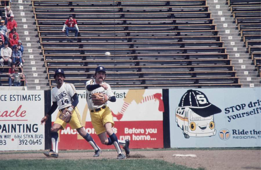
Sacramento Solons
Sacramento Solons
Alrighty. The team name is based on an actual person Solon was a Greek law maker way back around 600 BC. Sac-town being the capitol, they have Senators, obviously. The term Solons is a synonym for Senators. This logo was based on the California capitol building.

So, keeping that motif, I traced a picture of it. I tried to make it sleek, like the National's capitol building. I traced, made it two colors(The gold part is a darker color, and I made it yellow for the scheme. Since it's a Greek term, I thought a Greek Wreath would be a good add on. I kept the S cap logo from the time period, because it's pretty classic, I guess. The font is just a simple font, because I felt that matching it to the cap wouldn't work with the primary. The colors are used from the 1970s team, which trotted out in these.
The jerseys are loosely based on the link. I didn't want to use racing stripes, so I did a jersey like the Phillies' road set. It was a pretty simple design, I thought. On the caps, I gave them a yellow bill, when yellow became more prominent in my set. I thought of doing a Seattle Pilots wing look, but that wouldn't have existed!


Alrighty. The team name is based on an actual person Solon was a Greek law maker way back around 600 BC. Sac-town being the capitol, they have Senators, obviously. The term Solons is a synonym for Senators. This logo was based on the California capitol building.
So, keeping that motif, I traced a picture of it. I tried to make it sleek, like the National's capitol building. I traced, made it two colors(The gold part is a darker color, and I made it yellow for the scheme. Since it's a Greek term, I thought a Greek Wreath would be a good add on. I kept the S cap logo from the time period, because it's pretty classic, I guess. The font is just a simple font, because I felt that matching it to the cap wouldn't work with the primary. The colors are used from the 1970s team, which trotted out in these.
The jerseys are loosely based on the link. I didn't want to use racing stripes, so I did a jersey like the Phillies' road set. It was a pretty simple design, I thought. On the caps, I gave them a yellow bill, when yellow became more prominent in my set. I thought of doing a Seattle Pilots wing look, but that wouldn't have existed!


Monday, August 1, 2011
San Francisco Seals
So far, this is my favorite. The team is one of the teams that got screwed over when the Giants moved west. The team is traditionally navy and white. But I have seen logos with orange. I thought that would be neat, so I changed the old orange to a darker rustier orange, like the Golden Gate Bridge. The primary logo is a circle logo, simple, but I traced a seal logo, and made it modern. If anyone wants to see it up close, I have no problem with looking at that logo again. The SF logo is a modern version of the one they used. The two letters are drawn. Same witht he script. I've never done a script like that. Well, I did do my Dunedin Scots, but I did this one better. I went with orange with navy outline, because lighter with a darker outline looks better. I brought back the pin stripes, and went pretty simple on them.


Seattle Rainiers
One of the oldest teams in the league. Seattle had the Rainiers from 1919-1976. They almost played every year(not 1968-1972), partially due to the Seattle Pilots. The team was named after the nearby Mount Rainier. I wanted to include that in the logo. I changed the colors to a more pacific north west scheme, from the original navy and red. The color is a dark green, with the lime green and blue from the Sounders. I made an arched script, sort of a reference to the mountain. The Primary is the script with the mountain over it. The jerseys are simple, piping on sleeve jerseys. The number font matches the script. Instead of a grey jersey, I decided to take the green, and make it have a grey tint. So that is what that's all about.


Vancouver Mounties
This team moved from Oakland(Oaks) to Vancouver for the 1957 season. The logo I had in mind first was the MV cap logo you see. That was what I was excited about the most. That logo is what I based the set off of. A simple look with a block font. The primary logo I'm indifferent about, and I'm open to suggestions. I used a simple block script, and made the middle letters smaller just to change it up. I used red a lot for the jerseys. The caps were ALMOST khaki. Just kidding, but that would've been cool. They're red, and as you can see red with black accents run throughout. There is also a maple leaf on the sleeve.


Pacific Coast League
Alright. So here we go. I wanted to do something that is new, something different.
I was looking at this stadium website, and I came across a page with temporary stadiums. They included stadiums for the Dodgers and Giants, before Dodgers Stadium, and Candlestick park were built. The teams there were the Los Angeles Angels, and San Francisco Seals of the Pacific Coast League. I researched the liked what I saw. Some cool identities could be made, so here is what I made. The PCL was a very strong AAA ball league. The 8 team league was a league of their own, pretty much. The farthest west the MLB was in 1957 was in St. Louis. So with the closest team being over 1,500 miles away, they did their own thing. The Sacramento Solons actually did not have an affiliate for 1957. When the Giants and Dodgers moved, that scattered some teams, to Places like Phoenix and Honolulu. Teams like the Padres and Angels got their name from the PCL teams.
But what if the league decided to break ties with the MLB, and be their own pro league. Sure, there are some aspects of this I really didn't think out COMPLETELY. But here is a basic rundown. I'm making sets for teams from 1957. The logo has a palm tree and a mountain, for the south, and north pacific coast. Also note my cool 1950s template based on Chevys of that time.

Saturday, July 30, 2011
My Infographs
An infograph is a graphic, with information on it. Normally a chart or a graph. I've made a bunch recently, and I want to share! These are all self explanatory.


Winnipeg Jets Concept
I'm not a fan of the currents. I like what they went for, and it was just poorly executed. Nothing says hockey. It just looks like clip art. I wanted to change that. I wanted to make it more hockey friendly. I made the primary idea, the alt. With a few changes, obviously. I looked at Davidson's looking on how he worked his jets. I decided to use the Thrasher's shape, and put a jet in it. I decided to make the plane have a lighting effect on one side. I went with a stencil font just because I like what O'Brien is doing with his concepts with this font. But I'm gauging responses, and could change it.
The Jerseys are a simple design, and the alt is a throwback to the Ottawa RCAF Flyers that won the gold medal at the 1948 Olympics.

The Jerseys are a simple design, and the alt is a throwback to the Ottawa RCAF Flyers that won the gold medal at the 1948 Olympics.

Monday, July 18, 2011
CFL Pro Combat Pt 1
You heard me.
I've done a NFL series before, and I thought it would be fun to do some CFL concepts. In alphabetical order...
1/8 BC Lions
I didn't want black to be a major part of the jerseys, like the all black alt. These two follow the home and road sets. I made a sleeve design complete with piping. I put the alternate claw logo on the sleeves, so there wouldn't be 3 BC logos visible from the side. Also, the logo when backwards would habe the letters backwards. The numbers are located on the sleeves. Lastly, the pants were meant to match the jersey.

2/8 Calgary Stampeders
This was the last one I did. I like piping, there I said it. But not just piping can be found, I put a shoulder stripe running front to back, studded with black circles making them seem like horseshoes, inspired by the unused alternate logo. I thought the numbers worked well with the set, and it just happened to be the Broncos' set. I decided to make another set with the nike triangle gradient on the sleeves. The gradients are also on the pants stripe.

3/8 Edmonton Eskimos
I changed the logo. NO BLACK. I didn't realize how bad the logo looked like that. I deleted all forms of black. One thing that works, is the Packers' yellow/green/yellow/green. I didn't like how they had green monochrome, so I matched it with the packers. The sleeve stripes remain the same, and I threw in piping to separate from the Packers. I also didn't put yellow outlines on the numbers.

4/8 Hamilton Tiger Cats
I decided that a yellow jersey would be very nice. I gave the set tiger stripes, giving it it's own feel. Tiger stripes should be prominent in this set. The yellow socks make the leotard look a non factor. On a unrelated note, I think the Tiger-Cats have the best logos in sports.

Subscribe to:
Posts (Atom)