
Alrighty. The team name is based on an actual person Solon was a Greek law maker way back around 600 BC. Sac-town being the capitol, they have Senators, obviously. The term Solons is a synonym for Senators. This logo was based on the California capitol building.
So, keeping that motif, I traced a picture of it. I tried to make it sleek, like the National's capitol building. I traced, made it two colors(The gold part is a darker color, and I made it yellow for the scheme. Since it's a Greek term, I thought a Greek Wreath would be a good add on. I kept the S cap logo from the time period, because it's pretty classic, I guess. The font is just a simple font, because I felt that matching it to the cap wouldn't work with the primary. The colors are used from the 1970s team, which trotted out in these.
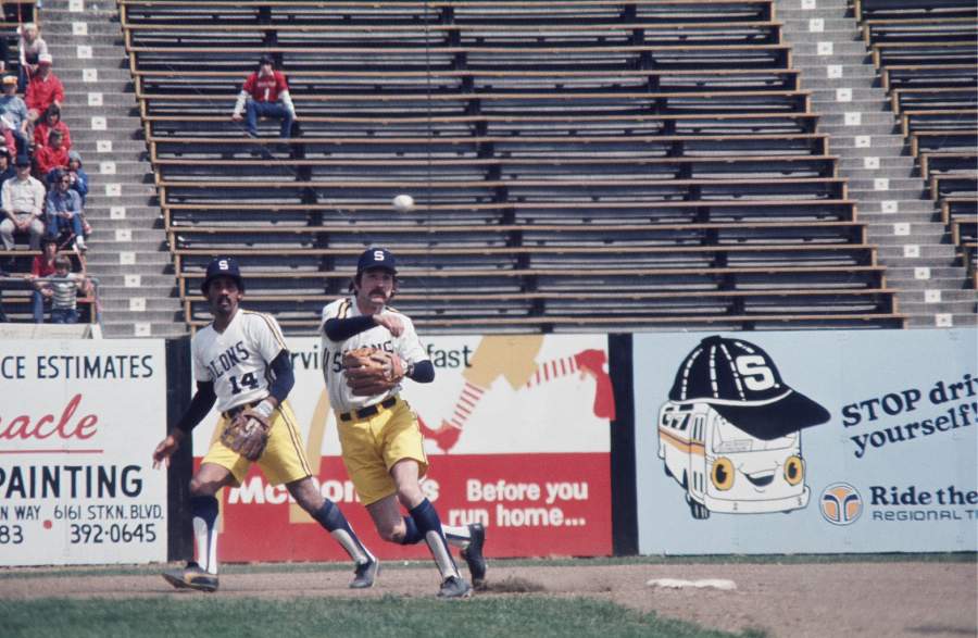
The jerseys are loosely based on the link. I didn't want to use racing stripes, so I did a jersey like the Phillies' road set. It was a pretty simple design, I thought. On the caps, I gave them a yellow bill, when yellow became more prominent in my set. I thought of doing a Seattle Pilots wing look, but that wouldn't have existed!


Best set
ReplyDeleteAwesome
ReplyDelete