Saturday, August 28, 2010

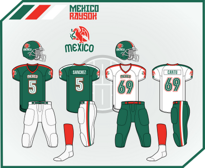
World Cup of American Football

Just never posted this, and came across it looking for some concept!

So I did these back during the WC2010. I thought it'd be fun if there was a high profile American Football World Cup. Basically, just the US styling on everyone. I just listed a bunch of teams that could maybe possibly fill a team. I got a few, and ended up doing just 7. I'd just like some input on this, and not let it go to waste as the last day of summer for me is here. Sorry the logos are kind of lame...


Sunday, August 22, 2010

Florida Orange

So my good friend entered his name into a fantasy application for a basketball team. I crank logos out as you know, so its no biggie that I had this.

His team is the Florida Orange, just one, and he only had one idea for a logo. I went to his house(we know each other IRL) and I drew out what I thought he meant when he told me about his idea. I drew the kinda logo you see below. An orange with part cut out, then basketball stripes or whatever they're called. I typed out the team name, then slanted it. I thought it looked really cool, so did he. I beveled the name, then added a FO logo for fun.

The jerseys are based on two former NBA set ups. The first two are based on the Milwaukee Bucks' jerseys back in the day. The alt is my idea, a retro jersey based on the Atlanta Hawks' 70s get up.


Comment, por favor.

Atlanta Braves

17/30 Atlanta Braves
So just some things, I LOVELOVELOVE the A tomahawk logo. That's the primary in this set. I thought it was a simple replacement for the script primary, it just seemed too wide. I also replaced the yellow with a peach-y colour, just to see how it looks. I thought it was pretty good so you we it here. The Atlanta and Braves script remained, and I added Georgia under the A logo as a sleeve patch. The jerseys are really the same for the home and alt. I think they have one of the best sets in the league. HOWEVA, the blue alt they use now sucks. Why don't they just make the jerseys like the shirts they sell? Well. I did.
ENJOY!

Tuesday, August 17, 2010

Adidas Championship Division: Part 4

Here it is. My final part of the series. Enjoy.

Atletico San Diego
San Diego is close to the border, so I went with a spanish name here. The name somewhat rhymes, and is pleasing to the tongue. Maroon and Orange isn't in this little league of mine. The logo just kinda grew and I didn't have a plan, more like what I could create. It's basically a crest with a sash deal running over it. The jersey design is a somewhat simple one. A design running up the front, with horizontal pinstripes that don't touch the design in the middle. The design from the logo is under the back numbers. I threw in a collar for good measure. Lastly, I went a little nuts and didn't use 3 striped socks.


San Antonio CD
Finally, I did it. A spanish name for a city with lots of spanish heritage. CD stands for Club Deportivo, Sports Club for non bilinguals. The logos had a few elements. The Alamo is located on the top of the logo, with a beveled star. I used a western font on the badge, with some added flair, or whatever they're called. Then i threw in a soccer ball and establish year for good measure. The jersey is a concept I've done for football, and it really seemed to work for soccer. I used the Spurs colours, just so the city would have a set of colours that tie the teams together.


Baltimore Monarchs
I think the Maryland flag is awesome, so it had to be used. The colours for this concept were based off the Maryland flag. The logo is a circle, with half a ball, and half a flag. I wanted to put a crown on top of the logo, a la Real Madrid, but decided against it. I just put some crowns on each side of the circle. I brought back the red and black stripes back to the MLS, just cause I thought they looked great. I used the pattern I used on my Argentina set on 32 in 32. I kinda just made some stuff like on the pants. Sometimes when I couldn't get a good sponsor I would think of a team, then kinda go in the same direction. Like Samsung for Chelsea into Sprint for this team!


Las Vegas United
Kind of uninspired name, but I thought it worked. I gave Vegas a team so they could have one of their own. The colours are the Las Vegas 51s colours, the Minor league team there. I've had the idea for a while, but finally did it. I'm pleased with the result. The logo is in the form of the famed Las Vegas sign. Las Vegas in circles running across the top, then United surrounded by the stars on the actual sign. I have a thing for a mid stripe down the middle. I think it's a good clean design. I went with a monochrome silver look, and ran with it. The clash is blue and black to just be different than the home, which would be worn a lot.

Sunday, August 15, 2010

Wednesday, August 11, 2010

West Florida Premier

My sister's soccer team merged with another local team. They were looking for a new logo, and I volunteered to do it. I got paid for the first time for this logo.


I just never posted it.

MLF Championship Logos

Sorry, the Astros ship I made was too good to not pass up, then the Bronze Bowl is an edited version with Apollo 13.

Oakland A's

16/30 Oakland A's
Not sure about you, but I like the whole white elephant story, and I think it's a shame that the elephant isn't used much. So I brought it back! BAM. I just ran the script over the ball on the primary. I also like the A's cap logo I used better than the current, like the Tigers logo. I got rid of the outlines on a green background, just because white outline with yellow is weak. I had to do something with the A's jersey. Theres no design on them now, so I threw some piping on the sleeve cuffs, but thats it, no neck. I really like how it turned out. Also only used one cap, instead of many caps without much difference.

Wednesday, August 4, 2010

What do YOU want to see?

If you haven't seen, the flag counter has skyrocketed recently. I want to know what you guys want to see done?

I've noticed some visitors from New Zealand, so maybe Rugby? If you want to see something done, comment below. I have a few concepts to share today, then I'm out of town for the weekend.

Sunday, August 1, 2010

Detroit Tigers

Hey! 300th post! Here is a gift to everyone!

15/30 Detroit Tigers
Now, this might be a little radical. I moved away from the classic Tigers look, and took it into a direction I thought would also be cool. I like the D primary logo better than the D on the cap, so I used it here. I also threw in some outlines to tie it in with the other logos. I realized the cursive scripts weren't doing much, and there wasn't any old English scripts yet. The primary is a throwback to the logo from the 70s-80s. Finally, I used the turn of the century tiger head as a patch, and on the primary. But everyone does that, since its awesome. On the scripts, I swapped the outlines. Currently, the script is blue/orange/white. And the white clashes with the grey on the road. Same on the jersey.

To me, the jerseys are odd because the piping is JUST on the chest. That just seems unbalanced. I also wanted to implement the colour orange more than they do now. The caps have the same pattern with a white logo on the home and alt, then orange on the road.