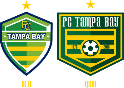
In the "Top 3 soccer crests" thread, I saw how amazing the Ft. Lauderdale Strikers logo was. I was jealous, because they're my home team's rivals, and our logo kinda stinks.
So last night I started sketching a logo. I realized that I do soccer logos better freeform on inkscape. I really didn't have any aspects to keep other than green and yellow stripes, a star for the NASL championship, and the team name. I decided on a home plate shape crest, just something simple. The old and new team both had green/yellow/navy color schemes. I decided that I could change that. I swapped navy for a darker green. I've never made a soccer ball using shapes, I would always find clipart or something, but I'm glad I did for this. I made a cool soccer ball similar to most teams these days. The years on each side are the years the Rowdies were first founded.

The jerseys are a mix of the currents, and old set, but mostly the old set. You know what? Just look.

I did a stadium concept, which can be seen on Stadia Arcadia.

I love this rebrand! Kept the elements that work and updated the rest. Really solid work. Stumbled across this blog accidentally. I'll be checking back regularly!
ReplyDeleteThanks man! I always like seeing comments.
ReplyDeleteSucks that they went with the Tampa Bay Rowdies. Such an unoriginal name.
ReplyDelete