Sunday, July 26, 2015

Footy as Football - Bournemouth

I think I wont go in order, just when I turn it out.

Bournemouth is the last team to be promoted into the EPL. Bournemouth has red and black stripes, and is nicknamed the Cherries. Not too much to work with there. I decided to make a logo with a B with stripes coming out. I wanted to show motion in the football, with a throwback to one of the best logo the Cleveland Browns have ever had. 

I originally had the stripes go around the back like the Seahawks logo, but realized the B would be backwards on the left. I put the B logo on the side, which let me go with a black helmet to match. There's a lot of striping on the uniform, with the helmet, sleeves, and pants. It was the best way I could show the tradition that the team has with their vertical stripes.


Saturday, July 18, 2015

Footy as Football - Watford

The 2nd place team from the Championship is the newest team I've done. The team is nicknamed the Hornets, but have a red deer as their logo. It has 100% to do with the colors of the team. I didn't want to throw away tradition, so I kept the deer idea. In a style like the LAFC bear and the Buffalo Bills logo, I did a stylized deer in one color to make it look strong, modern, and bold. I wanted to show motion with the deer, so I made it rear up on it's back legs, but I threw in a ground to show that it isn't flying or anything.

Before I did the logo, I had the idea to do an Eagles' type helmet logo, but with the antler. That's not even the wildest thing about the helmet. Half is yellow, half is black. The current crest is like that, so I split it in homage. I like the uniforms a lot, but a lot of that has to do with the colors. I tried my best to keep black on yellow, but did throw some red in the sleeve in an angled stripe like Nike has used a lot.


Friday, July 17, 2015

Footy as Football - Noriwch City

I got an email a few months ago about a series idea. They basically asked if I was interested doing Football as Football, but the other way around. So basically, turning EPL teams into what they'd look like as NFL teams. I was like thanks, but I've been busy doing other series so I dunno when I'd get to it. But I finally came up with some ideas and went ahead and did some!

I do probably way too many soccer crests, so doing something fresh and that would test my designer abilities. So starting from the bottom, here is what the EPL would look like with NFL inspired logos.

Norwich is known as the Canaries. They have a unique yellow and green color scheme, so this was going to be fun. I did my best to make a mean looking canary. I took some cues from Brandoise and the Ravens logo and created what you see below. The uniforms will mostly be based on the kits the teams use, so I got a new template and based the uniforms of the ones Norwich wore last year en route to being promoted to the EPL.


Tuesday, July 14, 2015

Gateway Motorsports Park

I love Gateway, and I feel like St. Louis is a big enough market to establish roots in. Gateway though, needs a refresher. I feel like it needs some money pumped into the facility.

Though it's not in as bad as shape as my other tracks, I do have some ideas on how to improve. The track has similar banking to Phoenix. They also have pit road entrance and exit lanes that cut into infield grass. I say pave over it all, make the track feel like there's more room to pass. The infield road course is pretty much the same, but the run off is all asphalt. Offset the lack of grass with solar panels and stuff. Then, get rid of the gokart track on the infield and build garages to host races. I also put a model of the gateway arch going over the back stretch to make the track stand out. The crossover gate would be on hinges and close when the track is live.

With the crossover being the only way to get in, I got rid of the tunnel under the track coming out of turn 4. I made the stands a lot longer to stretch the entire pitlane, then reconstructed the stands in turn 1. Right now, the front stretch stands stop, then there's a building, then bleachers. I was looking at Phoenix and loved how their turn 1 stands are. There's luxury boxes and the stands actually turns with the track. I would love to do that, and give those fans a view of the front and turns. I put 3 separate video boards in the infield for the fans to watch. Other than that, I kept the drag racing track the same, located outside of the oval.

Sunday, July 12, 2015

Metroplex United

Metroplex United has a pretty short history too. In the 60s, the teams in North Texas were numerous and difficult. In the Texas League, there were teams in Ft. Worth, Dallas, Arlington, and Frisco. They all had poor attendance and youth systems due to the teams pulling from the same pool. A businessman who graduated from Texas-Austin thought the best way to bring a top level soccer team to Dallas would be to merge the teams that already exist, to get a super team quick. United in 1965 under the name North Texas United, the team changed the name to Metroplex in 1974, their first season in the American Premier League, after a 2nd place League 2 finish the year before. They began filling up more and more of the Cotton Bowl after successful seasons in the top tier, the stadium they still use today. Metro was their strongest in the 80s. They won league titles in 1980, 81, and 86. US Open Titles in 81, and 85, then a CONCACAF title in 1987. After the passing of their owner in 1995, the team was sold to a wealthy oil baron who wanted to be the next Jerry Jones. The team got relegated in 1998, before the owner hired a GM who had soccer knowledge to turn the team over. Two seasons later, they were back up to the top league. They haven't won any trophies since the 80s, but their fanbase is huge. Typically, the supporters groups are split by their home town going by the names of the teams before the merger. 

Metroplex has always had orange and white home uniforms. Traditionally, the clash uniform would be the color of the winner of the Cotton Bowl the winter before each season starts. They signed with Under Armour in 2011, who ended that tradition. They've had a lot of flag themed clashes, but this year they're representing the skyline.

So this was the 20th and final team in the APL. I may come back with League 2, but I'd really need some ideas before I go ahead with that.

Friday, July 10, 2015

Sporting KC Chiefs

If you don't know the story, Lamar Hunt started the Dallas Texans in the AFL. After competing with the Cowboys for fans, he moved the team to Kansas City. After a trip to Ireland in 1962, and going to the 1966 World Cup, he fell in love with soccer. Coming back to the states, he got involved with the APL. Dallas had teams throughout the metroplex, and their University of Texas alumni owner wouldn't sell his team to a SMU grad. There was a team in Kansas City, formed in 1955. In 1967, Lamar bought the team, and basically bought his way into League 2. Much like many European and South American teams, Hunt had the idea to make a sporting club, teams with the same name underneath the same ownership umbrella. In 1972, the team began playing in Arrowhead Stadium with the Chiefs, and Sporting was promoted based on more income allowing players to be bought. The Chiefs had a good 70s, with a league title in 1976, and a US open in 1977. Another league title in 1982 helped establish the team as a premier team in the midwest. Unfortunately, the team had a bad year in 1985, and were relegated to League 2. Two years after, they were moved up to the APL, the same year they won their 2nd USOC. The 90s were hard on KC. Hunt had trouble juggling promoting the World Cup and managing his team. Two relegations in this decade hurt the team, but they would eventually move back up in 1999. Since then, Lamar died, and handed the teams off to his children, who run it to this day.

The logo and kits are very similar to the NFL team that shares the stadium. In addition to the soccer and football team, Lamar helped bring the NHL to Kansas City before selling them in 1976 and the Ice Chiefs moving to Colorado and becoming the Rockies. Teams that have fell under the Chiefs umbrella include an Arena Football team and Major League Lacrosse team.

Wednesday, July 8, 2015

Racing Club Indianapolis

Racing Club Indy doesn't have a storied history. The team was started in 1941 at a stadium near the storied Indianapolis Motor Speedway, and thus the name was linked. RCI was offered a spot in League 2 when the league was formed, due to the success in leagues in the midwest. But Indy didn't have much success. The team couldn't draw many players in due to their midwestern location. They drifted around League 2, until League 3 was formed and gave Indy a reason to fight. In the 2nd year of League 3, they were relegated to it. They got back to League 2 from 1982 to 1988, before another relegation. The Checkers were in a bad place and they sold their team to a rich German who couldn't watch his adopted home's team struggle. In 1989 they won League 3 and were on the up and up. A few years later, they won League 2 to jump to the APL for the first time in their history. This gave the team leverage to build a stadium closer to downtown. After relegation in 2002, the team came back up in 2003. The team has a habit of getting relegated, just to see them be promoted one season later, much is the case to this years team, who finished 2nd in League 2 to be promoted once again.

The team did originally wear checkers, much like Croatia. But in the 50s, they went to a more modest blue color. In the 1990s, the blue became navy to keep up with the trend of uniforms. Still, the red and yellow clash kits are the fan favorites and have been on the clash for the better part of their history.

Monday, July 6, 2015

Yerba Buena SC

Along with other teams up the Pacific Coast, Yerba Buena had formed in the 30s. They were once rivals with a team named San Francisco Dragons. Since the name of the city proper was taken, their owner turned to the name San Francisco had before the American's bought the land from Mexico. Yerba Buena is a mint plant, which inspired both the city name, and the soccer team. In 1938, the team trotted out in mint color uniforms, but were the laughing stock of the league. They were nicknamed the Girl Scouts, which home fans turned into "Scouts" later. The crest has had a yerba buena leafs on it since their inception. The team's main rivals soon became teams around California. Sacramento, San Diego, and Los Angeles specifically. Much like SCLA, Yerba was invited to the first season of League 2 play, and they out and won the league, and was promoted to the top league for 1956. Kezar Stadium became the West Coast Soccer version of Yankee Stadium due to the overwhelming support from Bay Area residents. 1961 was their first league title. Two years later, they won the league and USOC. When Candlestick Stadium was announced and built, they declared that they would renovated Kezar to fit soccer more. The team went almost bankrupt from this, resulting in relegation in 1970. They moved back up two years later after stabilizing their team. Their rivalry kicked off with LA in the 70s, Yerba won the league in 77 and 78, then a USOC in 1980 and 84. The team was back at the brink of relegation after an injury to their star striker, and his back ups not filling the hole. They finished last, but were promoted the next year. They renovated their stadium in 1993 to a gorgeous 60,000 seat stadium in downtown San Fran. The boost that gave them lead the team to back to back USOC in 96 and 97, and a CONCACAF Champions league in 97 too. They won their 2nd CONCACAF title in 2006, and a US Open in 2009.

The Scouts have had some form of mint green and white since their formation. In the 1990s, they started going duel greens for pants. Their clash kits were orange and black for most of their history too.

Sunday, July 5, 2015

SC Los Angeles

SCLA has humble beginnings as a club started by 5 friends in the 1940s. The club experienced some success in the Pacific Leagues, before accepting an invitation from the APL League 2 to join the major leagues. The team had very good success early on. Promotion to the APL in time for the 1960 season meant the team had the exposure they wanted. The yellow and red striped club started to become the cool spot for Hollywood stars to be seen at in the 60s. Their first league title came in 1962, and another in 71. In the 70s, the team became fierce rivals with San Francisco based Yerba Buena SC. The team owns the US Soccer record for attendance after moving their home games against YBSC to the Rose Bowl. After 2 Yerba league titles, SCLA won the title in 1979. The LA also won two US Opens in 77 and 78, and a CONCACAF championship in 80. It was clear the power of US Soccer has shifted to the west coast. This run of trophies brought in the best players from Europe and South America. Another title in 88 bridged the gap between eras. Since 1998, the team hasn't finished lower than 5th during the season, making the playoffs each year. League titles in 98 and 99 with a CONCACAF Champions League added to the trophy case, but they weren't done there. From 2007-12, the team won 2 US Opens, 2 CONCACAF CL's, and 3 league titles. Many championships go through LA, and that looks like the case in the future.

After ordering red and yellow rugby shirts from a catalog in the 40s due to an influence from USC. The team has worn the same basic uniform since. The iconic stripes has been on the shirts since. The clashes were always Dodger Blue until the 80s, when more colors began to be introduced. In 2005, the team started wearing black, and has been that way since.

Friday, July 3, 2015

Nashville SuperSpeedway

So officially this will be part two of a new little series called Raysox's Racetrack Restorations! You've seen North Wilkesboro, and I'm gonna renovate some tracks on the computer to get some ideas done. I joke with my roommate, who is a huge NASCAR fan, that when we graduate we'll team up using his business major and my sport management major and get into the speedway business

So if you follow NASCAR, you'll know that the series schedule is packed with cookie cutter mile and a half tracks. They're decent racing, but about a third of the schedule is these tracks. Outside of Charlotte Motor Speedway, they all popped up or were renovated in the 1990s. It was a renaissance of crap, basically. In 2001, in the Nashville suburb of Lebanon, a 1.333 mile track was built. It sets itself apart from other tracks. For one, it has a concrete surface. It is also smaller than other mile and a half. The track hosted some minor league racing series over it's history, but in 2011 it shut down. Now I believe that if promoted right, any thing could be successful. So here is what I would do if/when I bought Nashville Speedway.

The track would be the same, there's nothing wrong with that. I believe NASCAR could make strides in the Nashville market, but what the track needs is some fresh buildings and tender love. Right now, the main grandstand is very small, way below expectations they had for the track when they developed it. I would make it so there's no bad seat in the house. There'd be a wide, tall grandstand stretching from turn 4 to turn 1. The infield would be completely redone. From the tunnel leading into the track, there would be exits to a camper area, and the main garage. Much like Indianapolis, this road would make a small highway in and out of the track. The RV section would mold to the area not covered by the infield roadcourse, which I did not change.

The garage area was a cool idea I had. One giant building. Stretching the length of pit road, it would have two wings of garages to house touring series a few times a week. The haulers would park on one side, and with openings on both sides, it would give cars easy access to go to the trucks, or the track. There would also be a media tower even with the start finish line, overlooking the front stretch and victory lane. To compensate for the blocked view, two giant video boards would be erected over the garages so the fans could watch from their seat. On summer weekends, these boards would double as a movie screen, a way to fill the seats and promote the track on weeks the track doesn't have events. Another addition to the track would be a small quarter mile oval in the infield. The track is probably too big to host weekly events like North Wilkesboro, so a small track that would bring fans on Friday Nights would be ideal.

Outside the track, there would be parking inside and outside the ring. On the backstretch, many fans could park and walk to their seat, or take a shuttle to the front. There would also be lights that would light up the track for those weekly races, and NASCAR events. Finally, two big welcome signs in the shape of guitars would welcome fans to the track near the tunnel.

Thursday, July 2, 2015

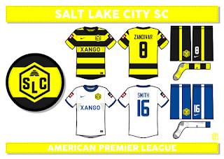
Salt Lake City SC

Salt Lake City SC was a newer team. The team was formed in the mid 70s to keep up with the other emerging western cities. Since their inception, they've worn black and yellow kits and were nicknamed the Bees. Utah is the beehive state, so it all fit. The team's first promotion came in 1983, heading up to League 2. After dropping down from 1987 to 1991, the team got new owners going forward. They didn't have much success however. They played in League 3 from 1995 to 2002. After climbing up to the top of League 2, they finally made the jump to the American Premier League for the 2011 season. The Bees have a sprawling fan base and are closely tied to the Mormon community. They have no major trophy, but are seen as sweethearts for some surprising wins against the best of the league on the road,

Los Angeles Clippers Rebrand

Really quick concept here. Total, it took about 4 hours to complete start to finish. The new logos are god awful. Very rarely do I see a logo that makes me want to completely rebrand them to cleanse my palette, but it happened yesterday.

A Clipper is a fast ship. There is imagery in there, but they never use it. I started sketching a logo in class yesterday of a wavy circle with a ship peaking into frame and some sails going out. I made it pretty quickly on my computer after some tweaks. I want people to realize what it is after looking at it after a while. The script is the Toledo Mud Hens font with some thick outlines. I also didn'[t want to bunch up the set with a bland LA logo, so what I did was make LA in maritime alphabet letters to put under the back collar.

The jerseys are new too. I never do basketball concepts, so I didn't have a template. I made a basketball one from my soccer template. Nike is taking over the NBA contract in a few seasons, so I made sure I used them. The home and away are based on the Louisville March Madness uniforms this year. The alternate I chose light blue over navy because it would be more unique.


Wednesday, July 1, 2015

Polski Chicago

Chicago was a city of immigrants, with several teams springing up as social clubs. Some teams fizzled, some teams prospered. Polski Chicago was a strong team located on the South Side, who combated the American team in the North Side. The Polski team formed in the early 30s, copying the uniform the Polish national team wore in the 1934 World Cup. The team doesn't have much history, but have spent a long time in the top tier of American soccer. Their first title was in 1943, and a US Open cup in 1954. The team had trouble finding sponsors, unlike other teams it connected to a group of people. From 1958 to 1964, the team was relegated. In the early 70s, the team brought in a few players from the 1970s World Cup as they expanded their roster to non Eastern European players. They figured as long as the owners remained in the right hands, then they could still represent Chicago Poles. The team won a US Open in 1973 and a league title in 1974. The owners of Polski were very against the league turning to playoffs to determine a champion, and it shows because that was the last title for the team.

The team continues wearing white and red, throughout their history. The clash is often light blue, but has been navy in recent years. The crest hasn't changed since their inception, which is just the coat of arms of Poland.